
Today I came home from and found one of my favorite publications, Interactions, on my kitchen counter. Imagine my excitement when I saw that the cover article for the Jan-Feb issue was "Proxemic Interactions: The New Ubicomp?". (pdf) The authors of this article are Saul Greenberg, Nicolai Marquardt, Till Ballendat, Rob Diaz-Marino, and Miaosen Wang, from the University of Calgary. (A list of some of the articles from the current issue of Interactions can be found at the end of this post.)
On the topic of proxemic interactions.... I welcome the research that is germinating in this area, and agree with the authors of Interaction's cover article that there is much work to be done in this space!
I've been searching for great examples of interactive displays in public spaces. Since there is much room for improvement in this field, much of what I share on this blog is a bit disheartening. Most of my user-unfriendly encounters with large displays happen when I'm in an airport, mall, health care facility, or a cruise ship. Things are improving, but at a slow pace. The best work I've seen so far has been in museums.
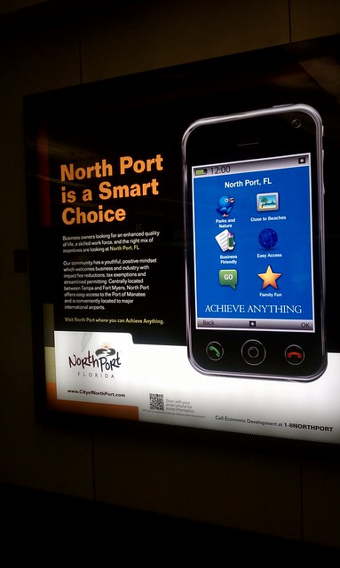 A few weeks ago I wrote a post about my nearly comical interaction with a large display that featured a QR tag that simply would NOT cooperate with my smartphone's tag reader. What were they thinking when they decided that the best place for a QR tag on a large display should be at knee level?
Interactive Display with QR Tag: Close Encounter at the Orlando Airport
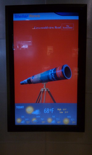
There is more to this story! On my way home, I had a few hours to kill at the Orlando airport. I stopped by a convenience store the Orlando airport, and discovered the non-static display below. I didn't notice the display the first time I was in the store that day.
I spotted another QR tag!
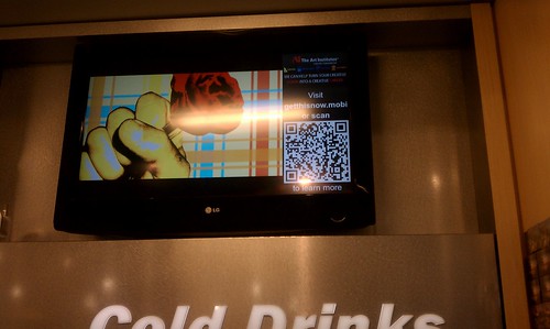
There were a few problems with this set-up. First, the display was located on a wall close to a ceiling, making it very inconvenient to scan with my phone. The page with the QR tag didn't stay up long enough for me to attempt to scan it, although waited around until it cycled back in view- three times. I gave up and took a picture instead, standing on my tip-toes with my arms extended over my head, the same position required to scan the QR tag, if it would stay put!
Another problem was that the display was perched above a high-traffic area, right above the refrigerated drinks. The only place to scan the QR tag was in a narrow aisle, behind the throngs of thirsty travelers making a bee-line to the cold drink section of the store. I was in the way of a number of people in this bee-line.
What were they thinking when they decided that the best place this large display featuring a QR tag should be several feet above eye-level in this particular location?
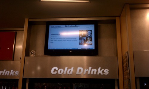
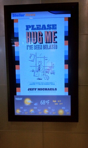
The displays in front of the store were located on either side of the doorway, at "body" level. This is a logical place to put a display. Potential customers can view the displays without getting in the way of other travelers.
I didn't notice QR tags on these displays. QR tags linking to web-based reviews of books I'd like to purchase would be useful in this scenario.
Non-static displays outside of the store:
PART II: Interactive Touch Screen Display Encounter at JC Penney
Interactive displays are cropping up everywhere. The display featured below is part of the Find More at JC Penney campaign. The following is a quote from a JC Penney press release:
"JC Penney has announced the launch of a new mobile initiative that connects mobile commerce with social and instore media applications that include location-based check-in offers and enhancements to its mobile apps. JCPenney's mobile initiatives are part of the company's investment in its overall digital platform, which also includes jcp.com, social media, and its in-store FindMore™ smart fixture."
"The smart fixture integrates JCPenney's online and offline stores by providing customers with a 52-inch interactive touch screen experience that allows them to view and purchase items from jcp.com while in a JCPenney store. Customers can also scan a bar code to get product details, access recommendations, or email data about an item of interest to themselves or friends."
Can you find the large interactive touch screen display? After shopping around in the mall, I decided to go to JC Penney and check out the sales. Below is what I passed as I entered the store. I went up and down the main aisle a few times before I noticed a large interactive display along a side aisle.

The stack of red holiday boxes obstructed my view:
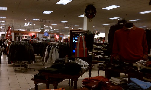
I didn't notice the display the first few times I walked in the other direction. From the back, the display looked like a poster.
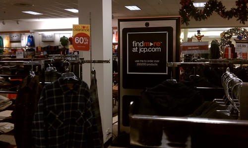
When I finally discovered the display, I was impressed with the slick graphics and stylish models.

I wasn't so impressed by the placement of the display. To interact with the screen, I had to stand in a narrow aisle, in the path of a steady stream of slow-walking shoppers, often moving in small groups, including parents with babies in strollers.
I wasn't impressed by the confusing array of input methods on the display. I noticed that the light blue square in the lower left-hand corner of the display is designed to provide access for people with disabilities. I couldn't figure it out.
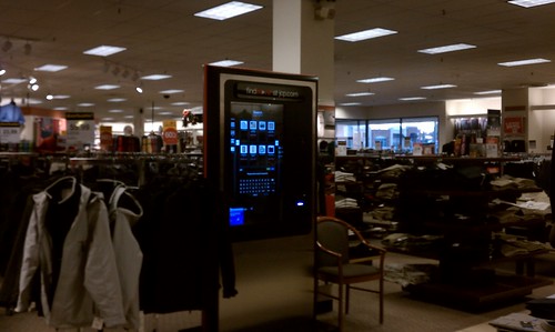
Accessibility: There is a need for research in this area!
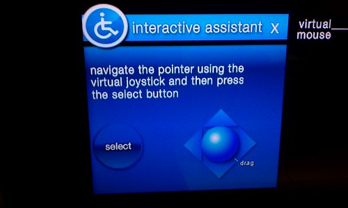
I shot video of my interaction with the screen, but found that I was in the way of shoppers, so I stopped. Not to worry. Below is a video taken by Mike Cearly, shared on his 11th Screen blog post, "Out and About: JC Penney's "Find More" Touch Screen". (Mike's impressions of this display were similar to mine and worth reading if this is an area that interest you.)
Mike uses his 11th Screen Scorecard to evaluate the technology he encounters in public spaces. I am updating a similar rubric to use when evaluating displays in public spaces. It is important to look at multiple dimensions, such as the physical placement of the display, weather and lighting conditions, how the display interoperates with mobile devices or a system of displays, how the content is presented/accessed across channels and devices, and how users share the experience with others.
Components of the 11th Screen Scorecard -Mike Cearly
Purpose: "What is the purpose of the solution? Is it to drive awareness? Acquisition? Loyalty? What is the brand trying to accomplish in this medium?"
Drama: "Does the solution make a big impact on the user? Does it make them stop and interact?"
Usability: "Can the user navigate through the experience with ease? Are the paths to information intuitive? There's also an element of functions, too, but I think that is much more subjective. Do the functions enhance the user experience?"
Interactivity: "How does the user interact with it? Is it gesture based? Is it touch-based? Can the user interact with it through any other enabling technology?"
Information: "How much and what kind of content is available for the user to interact with? Generally speaking, the more information and the different formats of information, the better."
Personalization: "What level of personalization does the experience provide?"
COMMENT
I've been obsessed with large displays and the amazing potential they hold for supporting all sorts of interactions - collaboration, planning, creating, information sharing, playing, viewing, communicating, learning, shopping, way-finding, artistic expression.
I'm also drawn to smaller screens and how we use our mobile devices- smartphones, iphones, e-readers, digital cameras, etc., to interact with the displays we encounter in public spaces. We are just beginning to figure out how technology can effectively - and seamlessly-support interaction between people who are co-located as well as located in different places.
INTERACTIONS Volume XVIII.1
Here is a list of some articles from the current issue of Interactions:
The (re) usability of everyday computational things: why industrial design will be the new industrial design (Roel Vertegaal)
Visual analytics and human-computer-computer interaction (Richard Arias-Hernandez, John Dill, Brian Fisher, Tera Marie Green)
The Cloud (Yue Pan, Eli Blevis)
Beyond interfaces and flows: abstractions for mapping organic architectures (Davide Bolchini, Adam Neddo)
No comments:
Post a Comment