I follow the O'Reilly Radar blogs and came across a recent post about an information visualization created by blprnt two years ago using Processing. I think it would have great potential if it was re-purposed for use on the Kinect! In the article, Edd Dumbill discusses the advantages of using Processing to create data and information visualizations.
One example of the power of Processing is an information visualization, "Just Landed -36 Hours, created by Jer Thorp. Jer gathered tweets from Twitter that included the statement, "just landed", along with location information for each tweet, within a 36-hour period, to create the visualization.
36 Hours- Just Landed is a great 3D visualization of air travel on our planet. I especially lik the different views that the application provides. As soon as I watched the Just Landed video, I thought it would be great if it could be revamped for use on the Kinect! (Leave a comment if you know of anyone working on a project in this area.)
Just Landed - 36 Hours from blprnt on Vimeo.
Information about the video from blprnt's Vimeo site:
"I was discussing H1N1 with a bioinformatics friend of mine last weekend, and we ended up talking about ways that epidemiologists model transmission of disease. I wondered how some of the information that is shared voluntarily on social networks might be used to build useful models of various kinds...I'm also interested in visualizing information that isn't implicitly shared - but instead is inferred or suggested...This piece looks for tweets containing the phrases 'just landed in...' or 'just arrived in...'. Locations from these tweets are located using MetaCarta's Location Finder API. The home location for the traveling users are scraped from their Twitter pages. The system then plots these voyages over time...I'm not entirely sure where this will end up going, but I am reasonably happy with the results so far. Built with Processing (processing.org) You can read more about this project on my blog - blog.blprnt.com"
RELATED
Strata Gems: Write your own visualizations: The Processing language is an easy way to get started with graphics
Edd Dumbill, O'Reilly Radar, 12/3/10
Showing posts with label interactive information visualization. Show all posts
Showing posts with label interactive information visualization. Show all posts
Dec 6, 2010


Oct 15, 2009
BEN: Breakable Experimental Network Simulation on a Multi-touch Wall (RENCI)
BEN, or Breakable Experiemental Network, is a mix of network visualization and multi-touch technology on a very large screen. The project aims to provide better network monitoring and management tools in a user-friendly, intuitive and efficient manner. It is also looks like great tool for learning about network engineering.
Hands-on networking!
BEN is part of the GENI project.
The music in the video is by Crystal Castles and Black Moth Super Rainbow.
Cross-posted: The World Is My Interface
Hands-on networking!
BEN is part of the GENI project.
The music in the video is by Crystal Castles and Black Moth Super Rainbow.
Cross-posted: The World Is My Interface
Oct 14, 2009
Near Interaction Multi-touch Tables and Displays: London College of Fashion & More
Near Interaction is a company based in Lisbon, Portugal, and London, England. They are a team of interaction and media designers, focsuing on interactive physical and digital installations. Here is a sample of their work:

Information about the Fashion Graduate Exhibition 2009 from NearInteraction's Vimeo site:
"The London College of Fashion Graduate Exhibition 2009 displays six multi-touch tables with integrated object recognition to unveil the 570 student portfolios. From a wide choice displayed on the three walls, visitors can make a selection of their preferred cards. Activating once a card is placed on the tables, visitors can move, zoom and rotate by touching the surface of the table a variety of portfolio images representing the chosen student...London College of Fashion Graduate Exhibition 2009 was designed and produced by NearInteraction in association with Paul Albert and John Nussey."
London College of Fashion Graduate Exhibition 2009
NearInteraction at the London College of Fashion Graduate Exhibition 2009 from nearinteraction on Vimeo.
Tangible Multi-touch Connectivity
Tangible Multi-touch Connectivity from nearinteraction on Vimeo.
"As part of Future Labs - Visual Experiences of the Future at FPC, Tangible Multi-touch Connectivity explores the multi-touch gestural concepts of touch to activate, pinch to enlarge and scroll to select within a multi-user environment, combined with the interaction concepts of user-identity, networks, and behavioural lifespan through a metaphorical game."
NearInteraction Playtecture: Physical + Digital + Kids + Play
NearInteraction at Habitar Portugal | Playtecture from nearinteraction on Vimeo.
Interesting, evolving work!

Information about the Fashion Graduate Exhibition 2009 from NearInteraction's Vimeo site:
"The London College of Fashion Graduate Exhibition 2009 displays six multi-touch tables with integrated object recognition to unveil the 570 student portfolios. From a wide choice displayed on the three walls, visitors can make a selection of their preferred cards. Activating once a card is placed on the tables, visitors can move, zoom and rotate by touching the surface of the table a variety of portfolio images representing the chosen student...London College of Fashion Graduate Exhibition 2009 was designed and produced by NearInteraction in association with Paul Albert and John Nussey."
London College of Fashion Graduate Exhibition 2009
NearInteraction at the London College of Fashion Graduate Exhibition 2009 from nearinteraction on Vimeo.
Tangible Multi-touch Connectivity
Tangible Multi-touch Connectivity from nearinteraction on Vimeo.
NearInteraction Playtecture: Physical + Digital + Kids + Play
NearInteraction at Habitar Portugal | Playtecture from nearinteraction on Vimeo.
Interesting, evolving work!
Apr 25, 2009
How soon will we see interactive information visualization for multi-touch & gesture systems?
The field of information visualization is growing. Until recently, most visualizations were created for use on a single PC or larger screen, allowing for interaction by only one user at a time. I have a feeling that this will be changing in the very near future.
Why? Interactive duo and multi-touch interfaces are becoming more common, and now come in all sizes of screens, from the iPhone, the Surface, and CNN's multi-touch "Magic Wall". People of all ages play interactive games on the Wii, often on large flat-panel displays. In my opinion, the time is right for those developing applications for the InfoViz world to think about harnessing the power of multi-touch.
Below is a picture of the front page of the Visual Complexity website. If you go to the site, you can select a visualization, and then explore it more in detail, as each picture links to a web-page that provides background information about the visualization project, the artist or team behind the project, and links to the project's website.
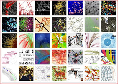
I took a look at a variety of the examples posted on the Information Complexity website, and think many would be enhanced by a transformation to a multi-touch, gesture, bi-manual, or duo/multi user system. I'm interested in learning what others think about this. If you are working on a collaborative information visualization project, feel free to add a comment and post a link.
Here is a a nice quote from the website:
Update: I did a search for "multi-touch" on the Visual Complexity website and found a couple of interactive applications:
Reactable (I've posted about this system a few times!)
(Reactable website)


Why? Interactive duo and multi-touch interfaces are becoming more common, and now come in all sizes of screens, from the iPhone, the Surface, and CNN's multi-touch "Magic Wall". People of all ages play interactive games on the Wii, often on large flat-panel displays. In my opinion, the time is right for those developing applications for the InfoViz world to think about harnessing the power of multi-touch.


Below is a picture of the front page of the Visual Complexity website. If you go to the site, you can select a visualization, and then explore it more in detail, as each picture links to a web-page that provides background information about the visualization project, the artist or team behind the project, and links to the project's website.

Here is a a nice quote from the website:
| "Functional visualizations are more than innovative statistical analyses and computational algorithms. They must make sense to the user and require a visual language system that uses colour, shape, line, hierarchy and composition to communicate clearly and appropriately, much like the alphabetic and character-based languages used worldwide between humans." Matt Woolman |
Update: I did a search for "multi-touch" on the Visual Complexity website and found a couple of interactive applications:
Reactable (I've posted about this system a few times!)
(Reactable website)


Subscribe to:
Posts (Atom)