Jul 30, 2012

Sound IS Important: Sonification, sound synthesis, sound design, interactive sound, the Olympics..

I happened to be listening to the radio and heard an interesting interview featuring on Dennis Baxter, the sound designer/engineer for the 2012 Olympics.  The interview, along with examples of sounds, are provided on the NPR website:

Making The Olympics Sound Right, From a 'Swoosh' to a 'Splash'
Becky Sullivan, 7/28/12, NPR   Listen to this story (All Things Considered featuring r, 5 min, 54 Sec)

Not all of the sounds you'll hear during the Olympics are "real". There are a few sports that are impossible to capture accurately, and for this reason, Dennis Baxter explains, special techniques are used.  

If you'd like to dig deeper into the world of sound, take a look at "The Sonification Handbook", edited by Thomas Hermann, Andy Hunt, and John G. Neuhoff.  The editors have backgrounds in computer science, physics, interactive sonification, multi-touch, music, psychology, auditory percpetion, and neuroscience, collectively.


Below is a description from the book's website:
"This book is a comprehensive introductory presentation of the key research areas in the interdisciplinary fields of sonification and auditory display. Chapters are written by leading experts, providing a wide-range coverage of the central issues, and can be read from start to finish, or dipped into as required (like a smorgasbord menu)"


"Sonification conveys information by using non-speech sounds. To listen to data as sound and noise can be a surprising new experience with diverse applications ranging from novel interfaces for visually impaired people to data analysis problems in many scientific fields." 


"This book gives a solid introduction to the field of auditory display, the techniques for sonification, suitable technologies for developing sonification algorithms, and the most promising application areas. The book is accompanied by the online repository of sound examples.The book is a comprehensive introduction to this interdisciplinary field."


The PDF version of the Sonification Handbook can be downloaded for free:
http://sonification.de/handbook/download/TheSonificationHandbook-HermannHuntNeuhoff-2011.pdf 

RELATED
This section includes a few interesting videos that are best viewed with headphones, along with a number of links to explore.

Andrew South - Sound Designer Show reel

Andrew South - Sound Designer Showreel from Andrew South on Vimeo.

Blip Shaper Walkthrough, Christian Bannister 

Blip Shaper Walkthrough from christian bannister on Vimeo.
FYI:  Christian Bannister's projects

Duet for Synthesizer and the Washing Machine, John Keston, Web Baker 
Produced using binaural sound, use headphones for best effects


Motion-driven Concatenative Synthesis of Cloth Sounds (SIGGRAPH 2012)


99% Invisible: Sound of Sport
Roman Mars, Turnstyle, 10/19/11
Social Sound Design "SSD is a Q&A site encompassing all the wonderful disciplines of sound design: film, game, art and installations, sound effects, new media, software, programming (Max/MSP; Pd, etc.), Arduino and micro-controllers, gear, feedback, recording, techniques and tips... as long as it involves sound design it is welcome here!"
NIME 2012 Online Proceedings (New Interfaces for Musical Expression)
NIME 2013
Big Fat Audio 
Provides royalty-free downloads of sound effects and more.
Perry R. Cook, Professor Emeritus, Princeton
(Author of Real Sound Synthesis for Interactive Applications-2002)
AKPeters Sound Examples (listen if you are curious)
Adding a 3D Positional Effect to a Sound (XNA Game Studio 4)

Jul 29, 2012

LONGBOARDING FREERIDE, an HD Extreme Sports video.

I have a secret. I enjoy watching Extreme Sports HD videos. This one is from  has breathtaking scenery. On a large screen, it might lure you into believing that you are the longboarder, gliding around the hills and curves!

About longboarding, from the Original Skateboards website:

"Put a longboarder at the top of that same hill with a longboard designed to handle it and he will get to heaven first, every time, no death required.  A longboard is a stress relief, a mode of transportaton, and a sorce of surf, snowboard inspiration.  Anyone can learn, it is safe, there are no age barriers and no one is going to charge you for a lift to the top."

Riders in the video were Petter Reinem, Axel Serrat, Brett Ciabattini, Will Stephan, Aleix Gallimo, Daniel Harris, Brian Bishop, Michael Virgin Jr. , Molly Lewis, and Scott Imbrie. Filmers were Nick Patrick, Brad Imbrie, Jay Cagney, Aleix Gallimo, Axel Serrat Dunia Vidal, and Sam Weaver. The video was edited by Nick Patrick.

RELATED
Extreme Sports HD Videos Blog
Apex 40 Longboards
Original Skateboards
Previous Post:  GoPro Wearable (extreme) Sports Camera:  I want One!
Extreme Sports Video Example:


Discover Extreme Sports | Extreme Sports HD by DiscoverXtremeSports


Blast from the 2009 past: News, Videos, and Links about Multi-touch and Screen Technologies

One of the things I like to do is share updates about the world of multimedia, multi-touch, gesture, screen, surface, and interactive technologies, focusing on off-the-desktop applications and systems. When I started this blog, I had to put forth quite a bit of effort just to FIND interesting things to blog about.  


These days, there are so many sources that focus on emerging - and now commonplace- interactive technologies, my main challenge is to filter the noise.  Where do I begin?


My archives are vast.   I randomly picked the year 2009 and came across one of my previous posts, "News, Videos, and Links about Multitouch and Screen Technologies."   The post is long, and contains a number of videos and links that probably will be of value to a future curator of the history of technology.


I welcome comments from readers who might be able to help me update information about various applications and systems I've featured on this blog in the past. 

The pictures are screenshots from the results of an  image search for "interactivemultimediatechnology".  Over the past 6 years, I've posted quite a few!


Jul 23, 2012

Men's Interest Section at Barnes and Noble: Girls Not Allowed?

I was browsing at a Barnes & Noble in Charlotte, N.C. this weekend and was surprised when I looked up to see that I was in the "Men's Interest" section.  Is this the message the bookseller wants to give to half of its potential customers?  


I don't think it was intentional.  It was just one of many subtle- and not-so-subtle - reminders that our society has a long way to go to encourage females, of any age, to consider computing and related technical fields of work and study.


Although women have made inroads in fields such as law and medicine, this is not true for many technical fields.  According to a thoughtful article written by Rane Johnson-Stempson, of Microsoft Research, a study by the Computing Research Association indicated that female students were only 14% of computer science graduates in the U.S. in 2011.  The under-representation of women in computer science and related technical fields in 2012 continues to be a problem, on many levels. 
RELATED
Unlocking the Clubhouse: Women in Computing was published about ten years ago. The book was an outgrowth of the research of Allan Fisher and Jane Margolis, of the School of Computer Science at Carnegie Mellon University, and is still worth reading.


Getting more women into computer science
Connie Glasser, Atlanta Business Journal, 5/11/12
"Just when we need every available gifted mind to help business recover from the Great Recession, we can't afford to overlook the contributions that women could make if CS environments were more inclusive."


Addressing the Need for More Women in Computer Science Programs
Rane Johnson-Stempson, Microsoft Research Connections Team, 2/3/12


Breaking the Brogrammer Code: Margo Seltzer's View on Women in Computer Science
Morgen E. Peck, Txchnologist, 6/27/12


Marissa Mayer on Women in Tech: CNET's CES 2012 Panel (January, 2012)
"Right now it is a good time for women to be in tech, but there are not a lot of women in tech..."


Giving Women the Access Code
Katie Hafner, New York Times, 4/2/12


Percent of Bachelors going to Women: Not getting better among Computing Disciplines
Computing Education Blog, 5/11/12

Presentation: Unlocking the Clubhouse:  Developing Software Education and Practices for Diverse Beginners, Jen Myers, 11/19/11


Why are there so few women in Computer Science?
A Syster, Best of Systers Blog, Anita Borg Institute for Women and Technology


Anita Borg Institute for Women and Technology

National Center for Women and Information Technology


Jul 21, 2012

Musings about NUI, Perceptive Pixel and Microsoft, Rapid Creative Prototyping (Lots of video and links) Revised

It just might be the right time for everyone to brush up on 21st century tech skills. iPads and touch-phones are ubiquitous. Touch-enabled interactive whiteboards and displays are in schools and boardrooms.  With Microsoft's Windows 8 and the news that the company recently acquired Jeff Han's company, Perspective Pixel, I think that there will be good support - and more opportunities- for designers and developers interested in moving from GUI to NUI.    


In the video below, from CES 2012, Jeff Han provides a good overview of where things are moving in the future.  We are in a post-WIMP world and there is a lot of catching up to do!

CES 2012  Perceptive Pixel and the Future of Multitouch (IEEE Spectrum YouTube Channel)


During the video clip, Jeff explains how far things have come during the past few years:
 "Five and 1/2 years ago I had to explain to everybody what multi-touch was and meant. And then, frankly, we've seen some great products from folks like Apple, and really have executed so brilliantly, that everyone really sees what a good implementation can be, and have come to expect it.  I also think though, that the explosion of NUI is less about just multi-touch, but an awareness that finally people have that you don't have to use a keyboard and mouse, you can demand something else beside that.  People are now willing to say, "Oh, this is something I can try, you know, touch is something I can try as my friendlier interface"."

Who wouldn't want to interact with a friendlier interface?  Steve Ballmer doesn't curb his enthusiasm about Windows 8 and Perceptive Pixel.  Jeff Han is happy how designs created in Windows 8 scales for use on screens large and small. He explains how Windows 8 can support collaboration. The Story Board application (7:58) on the large touchscreen display looks interesting.

I continue to be frustrated by the poor usability of many web-based and desk-top applications.  I like my iPad, but only because so many dedicated souls have given some thought to the user experience when creating their apps.  I often meet with disappointment when I encounter interactive displays when I'm out and about during the day.  It is 2012, and it seems that there are a lot of application designers and developers who have never read Don Norman's The Design of Everyday Things!


I enjoy making working prototypes and demo apps, but my skill set is stuck in 2008, the last year I took a graduate-level computer course.  I was thinking about taking a class next semester, something hands-on, creative, and also practical, to move me forward. I can only do so much when I'm in the DIY mode alone in my "lab" at home.  I need to explore new tools, alongside like-minded others.  


There ARE many more tools available to designers and developers than there were just four years ago.  Some of them are available online, free, or for a modest fee.  I was inspired by a link posted by my former HCI professor, Celine Latulipe, to her updated webpage devoted to Rapid Prototyping tools. The resources on her website look like a good place to start for people who are interested in creating applications for the "NUI" era.  (Celine has worked many interesting projects that explore how technology can support new and creative interaction, such as Dance.Draw.) Below is her description of her updated HCI resources:

"New HCI resource to share: I have created a few pages on my web site devoted to Rapid Prototyping tools, books, and methods. These pages contain reviews of various digital tools, including 7 different desktop prototyping apps, and including 8 different iPad apps for wireframing/prototyping. I hope it's useful to others. Feel free to share... and please send me comments and suggestions if you find anything inaccurate, or if you think there is stuff that I should be adding. I will be continuing to update this resource." -http://www.celinelatulipe.com (click on the rapid prototyping link at the top)


IDEAS
Below are just a few of my ideas that I'd like to implement in some way. I can't claim ownership to these ideas- they are mash-ups of what comes to me in my dreams, usually after reading scholarly publications from ACM or IEEE, or attending tech conferences. 
  • An interactive timeline, (multi-dimensional, multi-modal, multimedia) for off-the-desktop interaction, collaboration, data/info analysis exploration.  It might be useful for medical researchers, historians, genealogists, or people who are into the "history of ideas".  Big Data folks would love it, too. It would handle data from a variety of sources, including sensor networks. It would be beautiful to use.
  • A web-based system of delivering seamless interactive, multi-modal, immersive experiences, across devices, displays, and surfaces. The system would support multi-user, collaborative interaction.  The system would provide an option for tangible interaction.
  • A visual/auditory display interface that presents network activity, including potential intrusions, malfunctions, or anything that needs immediate attention that would be likely to be missed under present monitoring methods. 
  • Interactive video tools for creation, collaboration, storytelling.  (No bad remote controllers needed.)
  • A "wearable" that provides new ways for people to express and communicate creatively, through art, music, dance, with wireless capability. (It can interact with wireless sensor networks.)*
  • An public health application designed to provide information useful in understanding and sepsis prevention efforts. This application would utilize the timeline concept describe at the top of this list. This concept could also be useful in analyzing other medical puzzles, such as autism.
Most of these ideas could translate nicely to educational settings, and the focus on natural user interaction and multi-modal i/o aligns with the principles of Universal Design for Learning, something that is important to consider, given the number of "at-risk" learners and young people who have disabilities.

I welcome comments from readers who are working on similar projects, or who know of similar projects.  I also encourage graduate students and researchers who are interested in natural user interfaces to and move forward with an off-the-desktop NUI project.  I hope that my efforts can play a part in helping people make the move from GUI to NUI!  


Below are a few videos of some interesting projects, along with a list of a few references and links.


SMALLab (Multi-modal embodied immersive learning)


PUPPET PARADE: Interactive Kinect Puppets(CineKid 2011)


MEDIA FACADES: When Buildings Start to Twitter

HUMANAQUARIUM (CHI 2012)


NANOSCIENCE NRC Cambridge (Nokia's Morph project)


Examples: YouTube Playlists
POST WIMP EXPLORERS' CLUB
POST-WIMP EXPLORER'S CLUB II

Web Resources
Celine Latulipe's Rapid Prototyping Resources 
Creative Applications
NUI Group: Natural User Interface Group
OpenFrameworks and Interactive Multimedia: Funky Forest Installation for CineKid
SMALLab Learning
OpenExhibits: Free multi-touch + multiuser software initiative for museums, education, nonprofits, and students.
OpenSense Wiki 
CINEKID 2012 Website 
Multitouch Systems I Have Known and Loved (Bill Buxton)
Windows 8
Perceptive Pixel
Books
Natural User Interfaces in .NET  WPF 4, Surface2, and Kinect (Josh Blake, Manning Publications)
Chapter 1 pdf (Free)
Brave NUI World: Designing Natural User Interfaces for Touch and Gesture (Daniel Wigdor and Dennis Wixon)
Designing Gestural Interfaces (Dan Saffer)
Posts
Bill Snyder, ReadWrite Web, 7/20/12

I noticed some interesting tools on the Chrome web store - I plan to devote a few more posts to NUI tools in the future.

Jul 19, 2012

TechCrunch Charlotte Highlights, Part Two- NexTable, Fritter, AddShoppers, MailVu, Queen Associates, Kyck


Untitled For years, the tech community in Charlotte was dominated by people who worked for the major financial institutions.  Things are changing.  Facilitated by social media and local meet-ups, groups such as Charlotte UX, Packard-Place, and Charlotte Hackers and Founders have created an energetic synergy that reflects the "can-do", positive attitude of the Charlotte region. 


Last week  I attended a meetup of TechCrunch and Charlotte-area techies, held at the uptown Packard Place entrepreneurial center.  My main purpose for attending the TechCrunch meet-up was to learn more about innovative technology start-ups in my region. Because the place was crowded and there were very few booths, I changed my strategy and wandered about, and stopped if anything interesting - like a T-shirt or a winning smile- caught my eye.  (See TechCrunch Charlotte Highlights: T1 Vision, inTouch Software)


Cards I Collected, Info I gathered


One group of enthusiastic techies had a working demonstration of their system, NexTable, the "next generation reservation, table management system and marketing solutions for restaurants".Since I worked as a waitress in my college days, and married a guy in the restaurant business (he's now a recruiter),  I know how crazy it is to make sure the reservation process goes smoothly.  From what I could see from the iPad interface, the reservation component would be very easy for busy restaurant staff to implement. 


The NexTable system looks like it would be helpful to wait-staff, customers, and restaurant owners.  It aggregates online reservations from any source, which is great for busy, hungry people. It provides a text platform for  customer reservations, wait-lists, confirmations, and notifications when tables are ready. Data generated from this system can be used to customize marketing campaigns.

Queen Associates:  Frances M. Queen
Queen Associates is an IT consulting group that provides talent for clients across multiple industries. They promote the hiring of veterans and minority candidates. "It takes many different voices, many different viewpoints and an environment of respect and inclusiveness to provide the best service for our clients." -Queen Associates website


fritter: Derek G. Dahl
"By eliminating order errors and the hassle of phone ordering, our cutting edge online ordering platform streamlines the food ordering and delivery process. Fritter.co creates ordering solutions for restaurants and hungry customers, providing quality cuisine at an affordable price. Support local restaurants while enjoying great deals and promotions."-Fritter website

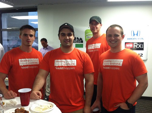
AddShoppers: Jon West
Untitled
AddShoppers is a social commerce analytics company. It helps internet-based retailers figure out how their social media efforts reach customers. The service is free.
"AddShoppers is the only social sharing platform built for online retailers. We help retailers increase sharing while at the same time providing unparalleled analytics".

MailVu  : Addy Kapur
MailVU provides a way to communicate through video email. It can be embedded into websites or even  learning management systems such as Blackboard and Moodle. For businesses, it can be embellished with a logo.


KYCK "The Global Soccer/Futbol Experience"  "KYCK is a digital media platform that discovers, curates, and delivers personalized and highly relevant soccer content to our users"
I wasn't able to catch the guy who was wearing this poster on his back.  I don't follow soccer, but it seams that the platform could be used by followers of other special interests, such as tracking weather disasters around the world, favorite music groups and events, and so forth.

Your Palm as Remote Controller (Video and Links)

Traditional remote controls for televisions and home media centers are particularly frustrating to use, in my opinion.  There are too many buttons, the buttons are too small, and it is easy to mess it all up.  (I've touched on this topic in a number of blog posts, such as UX of ITV: The User Experience and Interactive TV (or Let's Stamp Out Bad Remote Controls) and others, linked at the end of this post.)


There is hope for the future!  I'm happy to share a video about a method of remote control that might make interacting with my TV less annoying...and possibly pleasant! 


Researchers at the Technical University of Darmstadt have been working on a way for people to control their TV without a remote or hand-held device.  I think they are on the right path. The video shows how UI elements, mapped to the hand, can be touched, with accuracy, to interact eyes-free with a large-screen TV.  This work won the Best Paper award at EuroITV'12.


For more details, see Leveraging the Hand Surface as and Eyes-free TV Remote Control and the references below:
Niloofar Dezfuli, Mohammadreza Khalilbeigi, Jochen Huber, Florian Müller, and Max Mühlhäuser. 2012. PalmRC: Imaginary Palm-based Remote Control for Eyes-free Television Interaction. In Proceedings of the 10th International Conference on Interactive Television (EuroITV '12). ACM, New York, NY, USA, to appear. 


Niloofar Dezfuli, Mohammadreza Khalilbeigi, Jochen Huber, Florian Müller, and Max Mühlhäuser. 2012. Leveraging the palm surface as an eyes-free tv remote control. In Proceedings of the 2012 ACM annual conference extended abstracts on Human Factors in Computing Systems Extended Abstracts (CHI EA '12). ACM, New York, NY, USA, 2483-2488. http://doi.acm.org/10.1145/2223656.2223823

SOMEWHAT RELATED
Oh! No! Sony's "Mother of Remote Controls" for Google TV
Interactive Multimedia Across Platforms and Screens: Adobe's Open Screen Project; MEX Mobile User Experience Manifesto... (Please don't annoy the user!)
Usability of a Remote Control
Quick Link:  The Remote - Death by Voice Control?

Jul 18, 2012

Does Scanning This QR Code Make Me Look Silly? Interaction Mishaps with QR Codes Out and About

I am brave. 

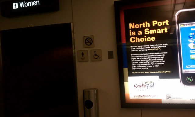
I am one of the few pioneers who have tried to scan QR codes, no matter what. I have squatted in front of a display to carefully align my phone with a code. I have disregarded many passers-by who had no choice than to walk around me.  I have blocked the path to the restrooms at a crowded airport, just to capture that special shot.
Poorly situated info dispay at thr Orlando airport

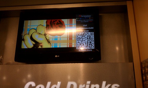
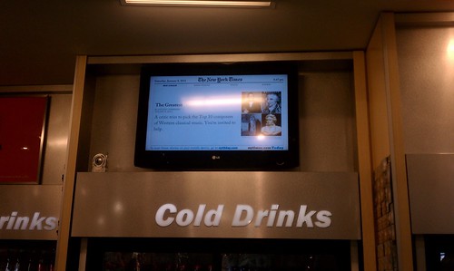
I was so intent on capturing one QR code that I stood on my tip-toes in front of a large refrigerated drink section of an airport convenience store full of thirsty people. I didn't care if I blocking the aisle to the drinks!  I just had to watch the ads cycle on a dynamic display for the right moment to scan and snap the QR code. 

My last QR encounter was at a Harris Teeter supermarket in Charlotte, NC. The purpose of the QR code was to link customers to the store's mobile app.  It turned out to be a laborious process. It had little to do with the QR code or my iPhone's scanning software.  It had nothing to do with my ability to steady my iPhone and quickly capture a QR code.  It had everything to do with a poorly-planned spot for this transaction to take place.  Even though QR codes have been around for a while, it seems that little thought has been given to the user/customer experience at the "point of scan".


This QR code made me look especially silly.  I got a few strange looks from other shoppers entering and exiting the store. 

Imagine what I looked like as I approached the automatic sliding door!  After a sashaying around for a few minutes, I captured the code. I guess I was suffering from QR Code Fatigue by that point, because after I downloaded the mobile app, I left the store and forgot all about it.

App store and mobile app screen shots:


There was another option for scanning the Harris Teeter QR code. At the checkout counter, there was one located on the screen on top of the cash register.  It was not possible to reach over everything in order to scan the code.  Even if I could access the QR code while checking out, it wouldn't be wise. I'd be holding up the line, and no-one wants to be "that guy".

IMG_3240


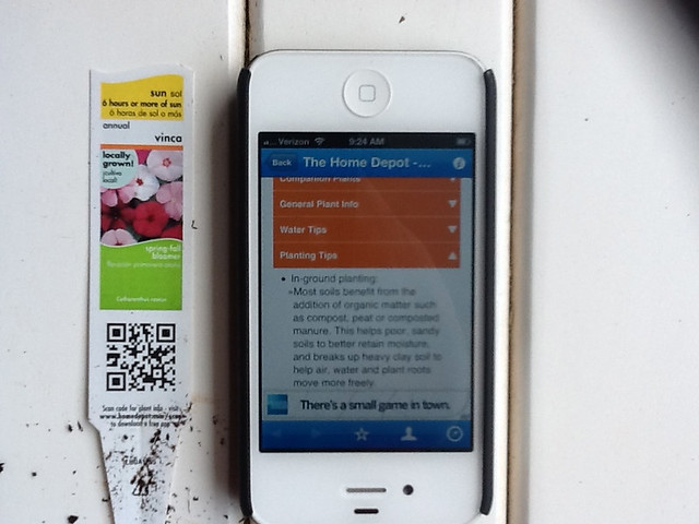
A couple of weeks ago, I decided to relax a bit and do some gardening. I noticed that every single plant had a tag, and every single tag had a QR code.  Instead of taking a break to sip some iced tea, like other neighborhood ladies,  I got my iPhone, wiped a plant tag clean (you don't want to scan a QR code obscured with garden soil), found a flat surface, and scanned. I spent too much time learning more than I ever cared to know about vincas and begonias.
IMG_0737

Poorly situated info dispay at thr Orlando airport

The following section is from one of my previous posts on this topic, reviewing my second encounter with a QR code at the Orlando airport. This particular QR code was on a display in a very crowded convenience store.

I spotted another QR tag!

There were a few problems with this set-up.  First, the display was located on a wall close to a ceiling, making it very inconvenient to scan with my phone.  The page with the QR tag didn't stay up long enough for me to attempt to scan it, although waited around until it cycled back in view-  three times.  I gave up and took a picture instead, standing on my tip-toes with my arms extended over my head, the same position required to scan the QR tag, if it would stay put!


Another problem was that the display was perched above a high-traffic area, right above the  refrigerated drinks.  The only place to scan the QR tag was in a narrow aisle, behind the throngs of thirsty travelers making a bee-line to the cold drink section of the store.  I was in the way of a number of people in this bee-line.

What were they thinking when they decided that the best place this large display featuring a QR tag should be several feet above eye-level in this particular location?  

The displays in front of the store at the airport were located on either side of the doorway, at "body" level. This is a logical place to put a display.  Potential customers can view the displays without getting in the way of other travelers.  

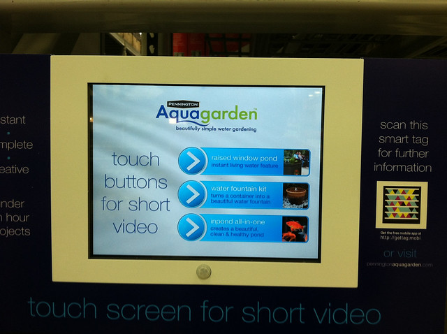
Here's a picture of one display, found at a garden center,  that provided an adequate user-experience.  Instead of a QR code, the display had a Microsoft Smart Tag. The display was located in a spot where I didn't feel silly. The tag was easy to scan, and it linked me to a website that had the same basic content as the touch screen below.  I could  "scan and go" if I was in a hurry, scan and look at the screen of my iPhone if I wanted to walk around the store, or stand in front of the display and watch the infomercials.
IMG_3174

The following picture is a screen shot of a site someone put up as a joke, no pictures, of course, because there are so few that do!  


Update 3/13
I was going through the drive-through pharmacy at CVS and spotted this QR code on the window. I asked the pharmacy technician what she knew about the QR code, and she said, "What QR code".  From our discussion, not much was known about this QR code, and no one to her knowledge had ever tried to scan it.  I tried, and failed to succeed.  


RELATED
Interactive Display with QR Tag: Close Encounter at the Orlando Airport
When The Web Meets The Real World: Moving Beyond QR Codes
Eric Savitz, Forbes, 8/4/11
"The 9 million users of the most popular QR code scanner for the iPhone scan just 4,000 QR codes per day."
How to Make It Easy for People to Scan Your QR Codes
Joe Waters, Dummies.com
Big box garden centers embrace QR tags
Garden Center, 5/9/11
GARDENING: QR codes can be a Gardener's Best Friend
Urban Domestic Diva, 6/11
Harris-Teeter Mobile Website

Jul 16, 2012

Updated: SEPTRIS, A Game to Teach about Sepsis, plus related links, in memory of Rory Staunton

Earlier this year I wrote a post about SEPTRIS, a game developed to teach medical professionals about sepsis.  I have updated the post in memory of Rory Staunton, a 12-year-old boy who died on April 1st after a small scrape on his leg became infected with Group A Strep. Rory took a turn for the worse, as his infection became a sepsis crisis.  Some of his symptoms went unnoticed when he was in the ER and he was sent home.  By the time he returned, it was too late. 


Rory's death was featured in a recent article in the New York Times, resulting in comments from over 1500 people at the time of this post. After reading through some of the comments, it was clear to me that much more work needs to be done in terms of research, public awareness, and the  the continuing education of our medical professionals, so that more lives can be saved. Sepsis shock can occur from a variety of infections and is not limited to Strep. It is a complex issue. (Information regarding Rory's story can be found at the end of this post.)


Below is my updated post:

According to a fact sheet from the Global Sepsis Alliance, sepsis "remains the primary cause of death from infection despite advances in modern medicine, including vaccines, antibiotics, and intensive care.  Sepsis, which is often misunderstood by the public as "blood-poisoning", is one of the leading cause of death around the world.  Sepsis arises when the body's response to an infection injures its own tissues and organs.  It may lead to shock, multiple organ failure, and death, especially if not recognized early and treated promptly.  Between on third and one half of patients with sepsis die...

...Rapid initiation of simple, timely interventions, including antimicrobials and intravenous fluids can halve the risk of dying. Patients with suspected sepsis should be referred immediately to an appropriate facility...Unfortunately, sepsis is still mostly overlooked and recognized too late"


SEPTRIS, a game about sepsis, was developed by a team of people from Stanford University.   The following article, written by Sara Wykes (Stanford School of Medicine), provides an in-depth account of the story behind the development of a game designed to teach medical professionals about sepsis:  Game on: Stanford develops new tool for teaching doctors to treat sepsis. 
Renee Reijo Pera
Credit:  "Dr. Septris"; Septris Screen Shot: Stanford University


RELATED
Septris CME Website (Stanford)
Septris Game
Septris Technical Design & Development Team
Brian TobinJamie Tsui, James Laird, Glenn Zephier

World Sepsis Declaration (pdf)
Sepsis Alliance
Global Sepsis Alliance
Pediatric Sepsis Initiative
STOP Sepsis Collaborative
Presentation:  Preventing Sepsis: Artificial Intelligence, Knowledge Discovery, and Visualization (Phillip Chang, Remco Chang,Judy Goldsmith) 


Sepsis: Emergency

SEPSIS Rap


Why is this important?
Sepsis Awareness is now one of my "causes", because my daughter is a sepsis survivor, and too many other deaths could be prevented.  The first World Sepsis Day is September 13, 2012 and to do my part for the cause, I plan to share information about this serious global health concern.


Below is a picture of my 24-year-old daughter, her husband, and son on Friday, March 30, 2012.   At the time this picture was taken, she felt fine and had just walked about a mile and a half or so on a family stroll. She was in perfect health.  She woke up in the wee hours of March 31st with the signs of an infection, took something for her aches and pains, and went back to bed.


The next morning, things were much worse. She didn't know it at the time, but her blood pressure was falling and the signs of sepsis were appearing.  Time was wasted going to an urgent care clinic. Fortunately, she was referred to the E.R, where her her symptoms were identified.  She received excellent treatment at Matthews Presbyterian Hospital.  It took several days until she was stable, and she was hospitalized for one week.  Unlike many people who experience sepsis, she did not suffer tissue damage or shutdown of her organs. Her treatment was initiated early enough to prevent this from happening. Although she survived, she suffered a great deal.

Below is a picture of my daughter as she was beginning to recover.
 
UPDATE 7/15/12  
My daughter is doing much better, but she experienced a great deal of fatigue for several weeks following her hospitalization. She's now 25, and happy to be alive.

RORY STAUNTON
I recently came across an article written in the New York Times, by Jim Dwyer, about Rory Staunton, a 12-year-old boy who died from a strep infection that resulted in a sepsis crisis that went untreated.  Unlike my daughter, Rory was discharged from the ER instead of being admitted for the intensive treatment that my daughter received. When his parents took him back to the hospital, it was too late. He died on April 1, 2012.  My daughter was battling sepsis in a hospital in North Carolina on the very same day. 


My heart goes out to Rory's family.  I know that he must have suffered a great deal.  

Although I am not a physician, I am sure that Rory's death could have been prevented, based on information in the article as well as information shared by Rory's parents on their website. To learn more about Rory's story, read the New York Time's article and a few of the comments. At the time of this update, over 1500 comments were listed on the NYT's website.


An Infection, Unnoticed, Turns Unstoppable
Jim Dwyer, New York Times, 7/11/12
Reaction to Column About a Boy Who Died
Jim Dwyer, New York Times, 7/14/12
Rory Staunton (website created by Rory's parents)
Rory's sepsis crisis was the result of toxic shock from a Strep A infection.  Sepsis can also be the result of other types of infections. The main thing to know that  is that once sepsis sets in, the patient requires immediate and intensive treatment, guided by an infectious disease specialist.  

Jul 15, 2012

60-Minutes Segment about iPads and Autism; James Winchester's Tech and Special Needs Blog

Tonight's episode of 60 Minutes included a repeat of a segment about the use of iPad apps with young people who have autism spectrum disorders.   I missed it, but I found it on the CBS website. 


Along with the segment, I found several related videos and transcripts. If you have a moment, take the time to look!


Apps for Autism (60 Minutes Video)

RELATED
Interview of Temple Grandin about autism
Temple Grandin's Unique Brain
SEN Classroom: Ideas and Tech in a SEN Classroom
(James Winchester's blog)
James is a special educator who has a wealth of  "how-to" knowledge about technology and special needs. If you are interested, take a look at his blog's archive. He writes about iPad apps,  the use of the Kinect with students at his school, and more.  He specializes in a Life Skills curriculum, which focuses on social, communication, and vocational skills that the students will need as they become members of the community.  


I recently wrote a post about Po-Motion, an interactive tech start-up based in Winnipeg, Canada, and learned that the system is used as an interactive wall display in a sensory room at a school for children who have severe disabilities, including autism. More information about the use of this system, including a video, can be found on James Winchester's blog post, Po-Motion Interactive Wall in the Sensory Room.  


Comment:

In my work as a school psychologist, I use technology with students who have severe autism several days a week, along with my colleagues.  I plan to share more information on this topic from time-to-time in future posts. 


I am putting together a web page with resources about autism and technology. My resources include descriptions of systems and applications, videos, and presentation slides from a variety of researchers, developers, and practitioners.  Suggestions are welcome!


Catching up on music technology: Tornado Twins' "How to Make Dubstep in 10 Minutes"


I've been neglecting my musical experiments for too long.  My Yamaha Motif 8 is about 9 years old, and my last copy of MOTU Digital Performer is on a computer that died in 2007 or so.  In the past, I found that immersing myself in wave forms and playing around with sound synthesis was quite relaxing.  I miss it.


Since I'm not a performing musician, I told myself not to trouble with researching electronic keyboard/workstations and fancy software. The practical thing to do is to stick with Garage Band to give life to the musical ideas that pop into my head.  I've played with music-making on my iPhone and iPad, hoping it would dampen my electronic music urge, but wasn't quite right.


What to do?  I still am not sure what I will do.  However, a link from a tweet by the Tornado Twins caught my eye today.  It led me to a short video that put me back into the music-creating groove.  Even if you aren't into music technology or electronic music, you might enjoy the opportunity to view musical creation visualized in the video, and appreciate the enthusiasm of the twin.


HOW TO MAKE DUBSTEP IN 10 MINUTES (Using the Dubstep Master Kit)


RELATED 
Tornado Twins Dubstep Master Kit
MOTU Digital Performer
Tornado Twins (The Tornado Twins are involved in music as well as video game development.)


SOMEWHAT RELATED

Comment: 
I plan to devote periodic posts to music technology in the future a bit more frequently than in the past.  It is a topic that is dear to my heart.
A little "history":
In the early 1990's, I bought an Ensonic KS-32 weighted-action keyboard.  I was exasperated by the 250-page manual that came with my keyboard. It was time to upgrade the computer, so I got a Mac Performa 600 CD, and purchased the very first version of MOTU's FreeStyle software to ease the music creation process.  I have been pleased with all of my MOTU products over the years, as well as the excellent tech support. 

MOTU Freestyle Sequencing Software (review)
Mike Collins, Sound on Sound, 1995