Showing posts with label visual communication. Show all posts

Nov 26, 2011

Revisiting Good Blogs: Eager Eyes (Robert Kosara, UNC-C)

Robert Kosara is a professor at UNC-Charlotte, responsible for opening my eyes to the world of information visualization and visual communication when I was a student in his graduate course a few years ago.  He is a deep thinker and his blog/website, Eager Eyes, is well worth taking the time to explore!


Here are some links to his posts:


You Only See Colors You Can Name "While color is a purely visual phenomenon, the way we see color is not only a matter of our visual systems.  It is well known that we are faster in telling colors apart that have different names, but do the names determine the colors or the colors the names? Recent work shows that language has a stronger influence than previously thought."

What is Visualization? A Definition

Understanding Pie Charts

Protovis Primer:  Part 1, Part 2, Part 3

Chart Junk Considered Useful After All

Six Niche Visualization Blogs

Linear vs. Quadratic Change

Nov 21, 2009

Want to make some multi-touch? Try PyMT- Python Multitouch. Featured in Make. (via Sharath Patali)

Sharath Patali, a member of the NUI-Group, has been working with Python Multitouch, otherwise known as PyMT, to create multi-touch applications.  He shared a link to a recent post in Make, featuring PyMT.  Sharath is the author of the UI Addict blog, and is currently doing his internship at NUITEQ (Natural User Interface Technologies).

I've been told that the beauty of PyMT is that it makes it "easy" to create multi-touch prototype applications using very few lines of code, which is great for trying out different ideas in a short period of time.  It helps if you already know Python!


PyMT - A post-WIMP Multi-Touch UI Toolkit from Thomas Hansen on Vimeo.

"PyMT is a python module for developing multi-touch enabled media rich applications. Currently the aim is to allow for quick and easy interaction design and rapid prototype development. PyMT is written in Python, based on pyglet toolkit."


PyMT Programming Guide


PyMT Website

Note: 
Christopher, author of The Space Station blog, is a member of the NUI-Group, and is building his own multi-touch table running his PyMT-based applications. Christopher is a student in Koblenz, Germany, studying computational visualistics, known as information visualization in the US.

Sep 23, 2009

Shift Happens Revisited: Do You Know 4.0 - Convergence and Social Media, by Xplane and the Economist


"This is another official update to the original "Shift Happens" video. This completely new Fall 2009 version includes facts and stats focusing on the changing media landscape, including convergence and technology, and was developed in partnership with The Economist. For more information, or to join the conversation, please visit http://mediaconvergence.economist.com and http://shifthappens.wikispaces.com."

More later.

Jun 5, 2009

White House Blog: Interactive Debategraph for Open Government Transparency.

Infoviz for Government!

I came across the following graphic of the interactive "Debategraph" from the White House Blog:

Debategraph screenshot

When you visit the Debategraph website, you can click on each item to see things reconfigured according to your selection. You can link to the site by clicking on the above graphic.

According to the Whitehouse Blog post, "Debategraph is a visual policy mapping tool that is being used for running citizen engagement on climate change in Europe. Debategraph translated our
mindmap of the redacted transparency proposals into the interactive Debategraph. In this format, the different proposals are rateable, addressable, and open to collaborative editing. People can also add supporting and opposing arguments to the proposals. "The aim with visual policy maps of this kind is to collaboratively weave together all of the salient proposals and arguments dispersed through the community into a single rich, transparent structure—in which each idea and argument is expressed just once—so that anyone can explore quickly and gain a good sense of the perceived merits of the relevant choices," says David Price, Debategraph's co-founder."

Jan 28, 2008

Visual-Literacy.Org

If you are interested in how people use multimedia to think, learn, and communicate, it is good to know about the concept of visual literacy.

Visual Literacy.Org provides two on-line tutorials about visualization. You can log-on to the tutorials as a guest:

Visualization for Business and Communication


Visualization for Engineering and Communication


Information from the website:

"This e-learning site focuses on a critical, but often neglected skill for business, communication, and engineering students, namely visual literacy, or the ability to evaluate, apply, or create conceptual visual representations. After this tutorial, students should be able to evaluate advantages and disadvantages of visual representations, to improve their shortcomings, to use them to create and communicate knowledge, or to devise new ways of representing insights."

For further reading, Visual Literacy.Org provides an interactive map of books on the topic:
Interactive map of books on Visual Literacy

Jan 16, 2008

Information Visualization: Revisiting Hans Rosling's TED presentation

This semester I'm taking "Visualization and Visual Communication", which is a course I've wanted to take for a while now. Today, we looked at a variety of websites that provide interactive information data visualization applications, which I'll share on this blog in the near future.

After class, I came home and revisited Hans Rosling's TED presentation about information visualization, and thought I'd share it on this blog. This video is about 20 minutes, and provides a good overview how simple interactive information visualization applications can help to convey concepts and correct misconceptions in an engaging, effective manner.


For those of you who work in K-12 settings, imagine how powerful this method of visual communication would be for students, if presented on an interactive whiteboard or display.


Nov 3, 2007

My Mind is a Web Browser: Temple Grandin's description of visual thinking

Temple Grandin, author of Thinking in Pictures and Other Reports From My Life With Autism (Vintage Books) 1996, has a website where she's posted interesting accounts of the way she thinks and perceives the world. As a school psychologist, many of the students I've worked with are visual learners and seem to think and perceive the world in a similar manner. For people who are auditory-verbal thinkers and would like to learn more about visual thinking, the article is a good start.

http://grandin.com/inc/mind.web.browser.html

Oct 12, 2007

Video: Photosynth Demonstration


Microsoft Live Labs: Photosynth

"The Photosynth Technology Preview is a taste of the newest - and, we hope, most exciting - way to view photos on a computer. Our software takes a large collection of photos of a place or an object, analyzes them for similarities, and then displays the photos in a reconstructed three-dimensional space, showing you how each one relates to the next.

In our collections, you can access gigabytes of photos in seconds, view a scene from nearly any angle, find similar photos with a single click, and zoom in to make the smallest detail as big as your monitor."

It looks like PhotoSynth has the potential to be used in creative, engaging ways in educational settings, especially for visual learnings. Imagine what students could do if given the opportunity to interact with PhotoSynth content on large screen displays!

Oct 4, 2007

About: Ubiquitous Computing- Grandpa and grandkids use a webcam and Skype across the miles; "EMR: The Movie".

A close relative was recently in the hospital that offered free WiFi. The youngest grandchild, my niece, brought out her flute and played Grandpa a tune.


The instant access to the Internet made it possible to quickly look up medical information as the doctors spoke, which made it easier to ask informed questions later on.

To make the time go faster during the 9 hour wait in the emergency room, YouTube comedy clips from old Johnny Carson shows really helped. All of the laughing during an otherwise somber situation caused a bit of a stir among the medical staff, other patients, and their families.

Why not put a few Wi-Fi enabled displays around the emergency room?

A new hospital near Grand Rapids, Michigan, has taken this concept a step further. The hospital will be offer patients Internet access from wide-screen displays in their rooms:

"Each room is private, with windows, and offers a foldout couch for overnight guests, individual temperature and lighting adjustments and a 37-inch TV screen that can show any of 30 recently released movies. The video component also provides Internet access and a portal to view a person's electronically stored medical records, even results from tests taken just the day before."

UPDATE (3/29/09)
Information about the hospital, Metro Health:
"Just what the doctor ordered": Metro Health puts video over IP network to educate and entertain its patients

"Because the entertainment system is IP based, Optimal installers were able to connect it to the hospital’s HL7 network, a nationally accepted protocol that allows health systems to talk to each other. By connecting the IP network to the HL7, the system can access all patient records, entertainment, educational videos, even admissions information."


Coincidentally, I found this link in one of my "Google Alerts" messages about electronic medical records, titled "EMR: The Movie".

The author of the post discussed how EMR - Electronic Medical Records - have the potential of providing a snapshot of the patient's medical history. He went on to muse about how EMR should be depicted as a movie- which I think is a good idea.

At least the record system should use a combination of text, icons, video-clips, and interactive 3D medical imaging. Of course, this would have to be displayed on a touch screen display such as a NextWindow Human Touch or Microsoft Surface.....

May 21, 2007

First attempt at a touch-screen "Poetry Picture Share" application


This was my first attempt at a "poetry picture share" application. It was designed for use on a multi-touch table and can be accessed remotely so people in different places can move things around on the screen.   The video shows how the application works on a NextWindow Human Touch interactive large-screen display.

Version 2 will be posted soon. I am planning on adapting this application for use with students with special needs, such as those who have autism or other communication disorders.

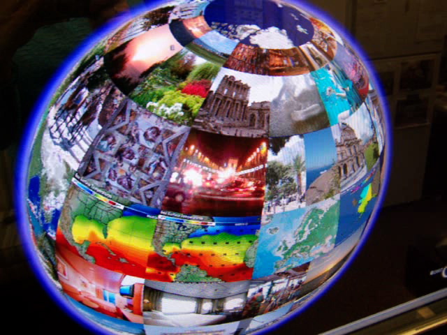
Google Earth with photo overlays on a touch screen 2


Here is another demo videoclip of a globe created in GoogleEarth using photo-overlays, with links to video clips uploaded to YouTube and embedded in individual posts on a blog. The above photo and the video clip show the application on a NextWindow Human Touch large-screen display.

This application would be great on a touch-table or touch-table set up on a drafting board. Although it was designed for a travel-planning application, it would work well in educational settings in subjects such as geography.

Feb 13, 2007

Imagini website "Visual DNA"

The Imagini.net website is a form of social networking that relies on pictures to develop each user's "visual DNA". It has an innovative method of using pictures to develop personality profiles. Each user's response is stored into a database is used to further develop the "visual dna" tool. This website is geared for networking and entertainment, not education, but it is has many features that could be used in other kinds of applications.