Showing posts with label Nathan Yau. Show all posts

Nov 25, 2011

Revisiting Good Blogs: Nathan Yau's Flowing Data

One of my favorite blogs is FlowingData, Nathan Yau's labor of love for the past several years. Nathan is a UCLA PhD candidate in statistics with a focus in data visualization.  He shares interesting tidbits of information on his blog, including those that relate to his main interests, social data visualization, self-surveillance, and data for non-professionals.  He supports accessible and useful data visualization.


Nathan is the author of  the book, Visualize This: The FlowingData Guide to Design, Visualization, and Statistics,  nicely explained in the video below:


ADDRESS IS APPROXIMATE: Stop-motion animation short by Tom Jenkins about the journey of a lonely desk toy through Google Street View


Address Is Approximate from The Theory on Vimeo.


Below is information about the video posted on Vimeo:
"Google Street View stop motion animation short made as a personal project by director Tom Jenkins. Story: A lonely desk toy longs for escape from the dark confines of the office, so he takes a cross country road trip to the Pacific Coast in the only way he can – using a toy car and Google Maps Street View. All screen imagery was animated - there are no screen replacements. 


Produced, animated, filmed, lit, edited & graded by Tom Jenkins (www.theoryfilms.co.uk / https://www.facebook.com/theoryfilms - !NEW MAKING OF PICS ON FB PAGE! / @thetheoryUK / http://twitter.com/#!/thetheoryUK). Shot using Canon 5d MkII, Dragonframe Stop Motion software and customised slider. Music by the wonderfull Cinematic Orchestra (www.cinematicorchestra.com) and the track is Arrival of the Birds."


Thanks to Nathan Yau (Flowing Data) for sharing this video!

Apr 30, 2011

"Visualize This": Nathan Yau's (FlowingData) book about information and data visualization

I've been following Nathan Yau's FlowingData blog for several years.  It is one of my favorites. His new book,  Visualize This : The FlowingData Guide to Design, Visualization and Statistics, will be out in July 2011, and is available for  pre-order on-line on Amazon, Barnes&Noble, and Wiley.  


I love Nathan's editor's comment about his latest chapter: "Thanks for yet another very enjoyable chapter.  If I had known statistics would be like this, I would have actually taken classes"


Visualize This: The Flowing Data Guide to Design, Visualization, and Statistics


Here is the plug for Visualize This, from the Wiley website:


"Data doesn't decrease; it is ever-increasing and can be overwhelming to organize in a way that makes sense to its intended audience. Wouldn't it be wonderful if we could actually visualize data in such a way that we could maximize its potential and tell a story in a clear, concise manner? Thanks to the creative genius of Nathan Yau, we can. With this full-color book, data visualization guru and author Nathan Yau uses step-by-step tutorials to show you how to visualize and tell stories with data. He explains how to gather, parse, and format data and then design high quality graphics that help you explore and present patterns, outliers, and relationships.
  • Presents a unique approach to visualizing and telling stories with data, from a data visualization expert and the creator of flowingdata.com, Nathan Yau
  • Offers step-by-step tutorials and practical design tips for creating statistical graphics, geographical maps, and information design to find meaning in the numbers
  • Details tools that can be used to visualize data-native graphics for the Web, such as ActionScript, Flash libraries, PHP, and JavaScript and tools to design graphics for print, such as R and Illustrator
  • Contains numerous examples and descriptions of patterns and outliers and explains how to show them
Visualize This demonstrates how to explain data visually so that you can present your information in a way that is easy to understand and appealing."

Jan 10, 2011

FedEx's "Our Changing World" Website: Interactive Information Graphics (Cartograms) and Augmented Reality Holographs on the FedX

Following a link from Nathan Yau's recent Flowing Data blog post, Our Changing World in Cartograms, I discovered that FedEx's "Our Changing World" website.  It provides an interesting way to explore data about various countries by mousing over countries on a map.

I have an HP TouchSmart PC, and found that the touch-screen interaction offered by this website was better than using the mouse.   I'm pretty sure that this website would be fun to use on a larger touch-enabled display, and in in the classroom, on interactive whiteboards.


To my surprise, I also discovered that the website offers a 3D augmented reality version of "Our Changing World": Experience the changing world in augmented reality
"See the world and the information that shapes it.  Watch it come to life as a 3-D hologram..."


(I'll play with the AR hologram later today.)


Note: 
The FedEx website provides links to additional resources for each topic area, as well as a link to the sources used for the data included in the information graphics.  It is important to remember that graphics do not always accurately depict the numbers!


RELATED
FedEx Launches Global Business Data Visualization Experience

"At experience.fedex.com, visitors can interact through a world map with data and content provided by The Economist Intelligence Unit on eight world trends initially, including air travel, people in cities, entrepreneurs and success, paper trail, business growth, education, money and happiness, and research and development.  Visitors also have an opportunity to analyze the data, share information, or participate in real-time, online polls....“At FedEx, we pride ourselves on our ability to offer great customer experiences,” said Malcolm Sullivan, vice president, Marketing, FedEx Express Asia Pacific. “Experience.fedex.com is an effective way for us to extend these experiences to the virtual world.  By making visualizations of complex and important information available to people everywhere, FedEx makes it easy for anyone to learn about their world and share their discoveries with friends.”"


FedEx Data Sources
FedEx: Our Changing World


FedEx Multimedia Center


Oct 19, 2010

Information Visualization for the People: The End of Swivel & Lessons Learned - a great post by Robert Kosara (Eager Eyes)

The following post is worth reading:

The Rise and Fall of Swivel.com
Robert Kosara,  Eager Eyes 10/12/10


Swivel.com is (was) a web-based information visualization company that incorporated the concept of "social visualization" by providing a means for people to explore and interact with large data sets, and then share their insights with others.  Robert Kosara's recent blog post about the demise of the company sheds some light on how a company with a great concept withered away.


RELATED
Why Swivel Shut Down 
Nathan Yau, Flowing Data 10/19/10


Swivel vs. Many Eyes
(Image taken from Robert Kosara's Eager Eyes blog)


Review:  Swivel vs. Many Eyes (Robert Kosara, 2/18/07, Eager Eyes)

Many Eyes 
"The site will be down from 10 a.m. EST until the move is complete, which should take a day or two if all goes well. We apologize in advance for any inconvenience this causes, but it will ensure a more reliable service in the long run."  10/19/10-Many Eyes Blog


About Robert Kosara - from eagereyes.org

"Robert Kosara is Assistant Professor of Computer Science at UNC Charlotte. His main research interests are information visualization for visual communication and theoretical foundations of visualization. Robert received his M.Sc. and Ph.D. degrees in computer science from Vienna University of Technology (Vienna, Austria). His list of publications can be found online on his vanity website.
Robert can be found on TwitterFacebookLinkedIn, and Xing. You can use this site's contact form to send him an email."

About Nathan Yau & Flowing Data - from flowingdata.com
"FlowingData explores how designers, statisticians, and computer scientists are using data to understand ourselves better - mainly through data visualization. Money spent, reps at the gym, time you waste, and personal information you enter online are all forms of data. How can we understand these data flows? Data visualization lets non-experts make sense of it all...As for me, I'm a PhD candidate in statistics. I live and breathe data. I also have a background in computer science and design. I do some freelancing from time to time, but mostly I'm just trying to work on my dissertation. You can find more about me here."
"

Jun 9, 2010

Beautiful Data: The Stories Behind Elegant Data Solutions (and a side trip of the color strata)

Beautiful Data: The Stories Behind Elegant Data Solutions

This is one of the books on my summer reading list.  I planned on buying this book last summer.  I got around to ordering it a few days ago, and today, it arrived in the mail.  


Nathan Yau,  the author of Flowing Data, was responsible for the first chapter, "Seeing Your Life in Data".   I'm a fan of the Flowing Data blog. Nathan shares quite a bit of interesting- and beautiful- information on his blog.  For example, his recent post, Strata of common and not so common colors, 


"The Color Strata includes the 200 most common color names (excluding black-white-grayish tones), organized by hue horizontally and relative usage vertically, stacked by overall popularity, shaded representatively, and labeled where possible. Besides filtering spam, ignoring cruft, normalizing grey to gray, and correcting the most egregious misspellings (here’s looking at you, fuchsia), the results are otherwise unadulterated."  - via Stephen, of Weather Sealed


After looking at all of the colors,  I followed Nathan's links and the links from his links (I love colorful rabbit holes!)... and found this graphic about the differences between girls and boys, from Doghouse Diaries, on the xkcd blog:


May 8, 2010

Facebook and Privacy Issues: Reflections about the ever-changing interfaces of Facebook and the growing number of Facebook-connected websites.....

I joined Facebook in 2007 when I was taking a graduate HCI-oriented course about privacy and security.  Heather Lipford, the professor,  and some of my classmates were working on a study about Facebook and privacy, so I agreed to participate as a subject.  What I quickly learned is that even graduate IT students can be puzzled about Facebook privacy settings. Facebook has made numerous changes to the way it handles privacy settings, and this has fueled research on this topic for the past few years (see links below).  


Too many "regular" folks are unknowingly sharing things they do not want to share with the world, and it is difficult for most of us, including myself, to keep up with these rapid changes.   For example,  last month I came across a video of Mark Zuckerburg (founder of Facebook), announcing Open Graph which is a way of making "connected, mapped web that is more "social, personalized, smarter, and semantically aware."  Zuckerburg's keynote presentation at the f8 conference was delivered on April 21st, yet on the day I posted about it, only a handful of people had viewed the video. 


As of this post, only about 731 people had viewed the presentation, yet the key points that were reviewed will impact how the information we provide Facebook is used, stored, and perhaps shared by third-party web-based applications.  With over 400,000,000 people on Facebook, this is an open invitation for those "in the know" to manipulate things in a way that many of us may not understand.  


In the video below, Zuckerburg mentions that Facebook's policy for applications integrated with Facebook prohibited the storage or caching of  data and information from the user for more than 24 hours. The rationale for the rule was to protect the privacy of Facebook users.  
At about 4:58 in the video, Zuckerburg discusses this policy, and announces that it has been changed. He then goes on to say, "We're going ahead and getting rid of this policy."  (5:09) This made the audience very happy (about 5:10):


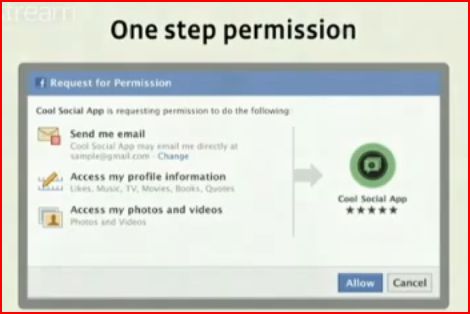
Zucherburg introduces the "One Step Permission" feature that provides third-party websites a simple means for users who have Facebook accounts to connect with the site.  The hitch is that the user can't move forward and access what they'd like to access on the site unless they make the quick decision to give up quite a bit of their Facebook information. This will now give the  host application use of your information, which they now can store ...forever, I assume.


Here is a screenshot of the single permissions dialog from the video at about 4:16:


Zucherburg's words:
"Now, if a person comes to your site, and gives you permission to access their information, you can store it. That means no more having to make the same API calls day after day. No more having to build different code paths just to handle information that Facebook users are (unwittingly?) sharing with you. We think that this step is going to make building with Facebook platform a lot simpler." 


I knew there was a BIG problem with Facebook's privacy settings when Nathan Yau, author of the Flowing Data blog, tweeted about his discovery of information that Facebook somehow shared without his knowledge. Nathan's recent post, "Evolution of Facebook Privacy Policies", contains a interesting visualization, created by Matt McKeon of the Visual Communication Lab at IBM, that provides an interesting look at Facebook's privacy policies from 2005 on.


The Evolution of Privacy on Facebook (Interactive graphic with options for viewing an animation or an image-based version.)


The blue area represents the default settings regarding the availability of your personal data. As you can see, the default settings allow a large set of personal information to be shared among your Facebook connections as well as the outside world.  As a member of Facebook, you must manually change your settings to make sure you have your preferred level of privacy. Don't assume this is taken care of for you by the application!


RELATED


"Your information is being shared with third parties Privacy settings revert to a less safe default mode after each redesign Facebook ads may contain malware Your real friends unknowingly make you vulnerable Scammers are creating fake profiles "

Privacy bog causes Facebook to disable chat
Caroline McCarthy, CNET News 5/7/10
Video: Major Facebook Security Hole Lets You View Your Friends' Live Chats
Steve O'Hear, TechCrunch 5/5/2010

Nathan Yau and Flowing Data

f8 2010 Breakout Session Videos

Previous Post:  Mark Zuckerburg's Recent Keynote at f8: Facebook's OpenGraph


HCI Lab at UNC-Charlotte:
"At the Human Computer Interaction Lab (HCILab) at UNC Charlotte, we investigate novel ways for people to interact with computers, and through computers with their environments. Our research covers a broad range of areas within Human Computer Interaction, such as Novel Interaction and Multimedia, Privacy, Creativity, and Visual Analytics. We collaborate with researchers in a number of areas related to HCI, such as visualization, gaming, art, and psychology. We also study interaction in a variety of domains such as intelligent information systems, information privacy and security, image processing and graphics, and intelligence analysis."
UNC-C's HCI Facebook Research Articles
Lipford, H. R., Besmer, A., and Watson, J. "Understanding Privacy Settings in Facebook with an Audience View." In the Proceedings of the USENIX Workshop on Usability,
Psychology, and Security (UPSEC 2008), April 14, 2008. pdf
Lipford, H.R.,  Hull,G.  Latulipe, C., Besmer,A.,  Watson, J. Visible Flows: Contexual Integrity and the Design of Privacy Mechanisms in Online Social Networking. In Proceedings of the Workshop on Security & Privacy in Online Social Networking, August 2009. pdf
Lipford, H.R., Watson, J., Whitney, M., Froiland, K., and Reeder, R.W. "Visual vs. Compact: A Comparison of Privacy Policy Interfaces. In Proceedings of CHI'10. Atlanta, Georgia, USA. April 2010. pdf
Strater, K., and Lipford, H.R. "Strategies and Struggles with Privacy in an Online Social Networking Community". In the Proceedings HCI 2008, Liverpool, UK. 2008. pdf
Watson, J., Whitney, M., and Lipford, H.R. "Configuring Audience-Oriented Privacy Policies." In the Proceedings of the Workshop on Assurable and Usable Security Configuration, ACM CCS, November 2009. (abstract)
SOMEWHAT RELATED
IBM's Visual Communication Lab is behind the Many Eyes website, which I used as a resource during when I was taking a course in information visualization and visual communication. At the time, I was looking at data related to the high-school drop-out problem in the US. I loved how the on-line Many Eyes application provided me with a variety of ways of looking at the data I had collected for my team's project. Since then, thousands of other people have utilized the Many Eyes website. Warning: If you are interested in data, stats, and information visualization, be prepared to spend a while exploring. It is an enticing rabbit hole!
Many Eyes: For Shared Visualization and Discovery

Cross-posted on The World Is My Interface

Dec 25, 2009

Flowing Data's Best Visualizations of 2009 (Nathan Yau): "It was a huge year for data"

"Data has been declared sexy, and the rise of the data scientist is here."  -Nathan Yau, Flowing Data
I started following Nathan Yau's Flowing Data blog nearly 2 years ago, when I was in Robert Kosara's information visualization/visual communication class at UNC-C.  What a great blog!  


Here is the short list- visit Flowing Data for the pics and details:
Honorable Mention:  MTV VMA Tweet Tracker
Honorable Mention:  Crisis of Credit Visualized (animation)
5.  Microsoft's Photosynth
4. New York Times' The Jobless Rate for People Like You
3. Open Street Map: A Year of Edits
2. Stanford University's  Protovis
1. Ben Fry's On the Origin of Species: The Preservation of Favored Traces


RELATED
Ben Fry's Origin of the Species: The Preservation of Favored Traces

Protovis
NYT's Jobless Rate for People Like You
Photosynth Website (Christmas lights featured on main page today 12/25/09  "Mintz Family Christmas")

Open Street Map
Crisis of Credit, Visualized
MTV MTA Tweet Tracker


SOMEWHAT RELATED
Dr. Kosara's EagerEyes site is a great resource to follow- I especially like his link to the History of Visual Communication website.
The Three Sexy Skills of Data Geeks (Michael E. Driscoll Dataspora Blog, 5/27/09)
Michael Driscoll's Book Recommendation:
The Elements of Statistical Learning:  Data Mining, Inference, and Prediction, Second Edition

Stanford University Viz Group


NOTICE
I'm gathering information about good examples of user-friendly multi-user interactive information visualization applications, preferably on multi-touch or gesture-based systems. Leave a comment and a link if you can point me in the right direction!