Focused on interactive multimedia and emerging technologies to enhance the lives of people as they collaborate, create, learn, work, and play.
Jul 30, 2009
Jul 29, 2009
Update on Multi-Touch, Multi-User NuMTyPYsics
A few months ago, I wrote a post about multi-touch "NuMTyPYsics". Here is an update:
Below is a video that shows how two use two single-touch Nokia Internet tablets to provide an emulation of multi-touch input for NuMTyPYsics, a drawing game that based on Numpty Physics:
Here's the description from Perlinet's YouTube channel:
"Using two single-touch tablets and a laptop running NuMTyPYsics, it's possible to emulate multi-touch input (max. 2 cursors - one from each tablet). This allows for precise input control and testing multi-touch applications. More info: http://thpinfo.com/2009/mt/"

The game is also based on Crayon Physics, using the Box2D engine.
Below is a video that shows how two use two single-touch Nokia Internet tablets to provide an emulation of multi-touch input for NuMTyPYsics, a drawing game that based on Numpty Physics:
Here's the description from Perlinet's YouTube channel:
"Using two single-touch tablets and a laptop running NuMTyPYsics, it's possible to emulate multi-touch input (max. 2 cursors - one from each tablet). This allows for precise input control and testing multi-touch applications. More info: http://thpinfo.com/2009/mt/"

The game is also based on Crayon Physics, using the Box2D engine.
Posted by
Lynn Marentette
Jul 28, 2009
Slideshare Presentation: Interactive Displays Perception, Awareness, and Interaction via Daniel Michelis
This is a good overview of interaction around displays in public spaces.
Posted by
Lynn Marentette
Jul 27, 2009
RENCI at UNC-Charlotte has a Multi-Touch Table in the Visualization Center!


The Urbanization Explorer Touch Table at UNC-Charlotte
(Pictures from the RENCI blog)
I wish this multi-touch table was around when I last took a class at UNC-C! With help from the RENCI Europa team, this table that was only a dream was finally built.
The following information was posted on the RENCI Vis Group Multi-Touch Blog:
"Jason Coposky and Warren Ginn from RENCI Europa delivered UNC-Charlotte’s Multi-touch Table to the Charlotte Visualization Center last week. Dubbed the Urbanization Explorer Touch Table, the device’s first role will be to display the Urban Growth Model, developed by the Center for Applied Geographic Information Science (CAGIS) and UNC-Charlotte’s Urban Institute. By accessing historical patterns of growth in the region, this application will provide forecasts on how much growth is expected to take place based on these historical patterns. Using satellite imagery for the 24-county region around Mecklenburg, for four time periods: 1976, 1985, 1996 and 2006, the Urban Growth Model tracks the advance of impervious surfaces, a key indicator of development, in expansion across the area since 1976, and estimates the extent of urbanization through 2030. With interfaces developed by collaborators at the Charlotte Visualization Center, multiple users will be able to select areas of interest, zoom, pan, and navigate the colorful, large-format maps using only their fingertips and on-screen digital tools."
"First introduced at North Carolina State University’s Institute for Emerging Issues annual forum this past Februrary, this multi-touch table represents the next leap in performance in touch tracking. As opposed to the previous Direct Illumination (DI) technique employed in the original table, this table employs Diffused Surface Illumination (DSI). By employing a sheet of Cyro Acrylite EndLighten with polished edges and LED Edge-View Ribbon Flex from Environmental Lights, we’ve been able to distribute the IR illumination more evenly."

"Infrared LEDs on a trip from Environmental Lights is applied to the inside perimeter of the frame where the polished Endlighten acrylic sheet will be installed."
I want one to try out my touch-screen experiments!
RELATED
RENCI Displays the Urbanization Explorer Touch Table
At the 0:48 mark, you can see the RENCI Charlotte Urbanization Explorer Tool:
RENCI - Emerging Issues Forum 2009, Raleigh, NC in HD from Renaissaince Computing Institute on Vimeo.
UNC-Charlotte RENCI websiteHierarchical multi-touch selection techniques for collaborative geospatial analysis (pdf)
Thomas Butkiewicz, Dong Hyun Jeong, Zachary Wartell, William Ribarsky, and Remco Chang
University of North Carolina at Charlotte
Posted by
Lynn Marentette
Labels:
Chesser,
computer science,
Europa,
interaction,
multi-touch,
RENCI,
Ribarsky,
UNC-C,
Vis Center,
visualization

 No comments:
Interactive "Multimedia" at the Supermarket!
I've seen a few displays place right on the shelf with the food items over the past few months. The ones I've seen at Wal-Mart are tastefully done and are not too intrusive, but they are not interactive.
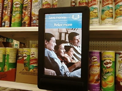
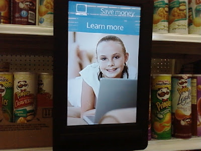
In my opinion,it would be much more useful if the screens were touch-enabled, so I could quickly access the information I needed. Who wants to stand in front of the Pringles while a video cycles through information that may not be what is needed?
Here is another example of an "interactive" display positioned at shelf-level:
I was in the cheese aisle at the supermarket the other day, and thought I heard something, but I wasn't sure what it was. I walked right by the source, and I was searching for it. Can you find it in the picture below?

(Picture taken by cellphone)
If you watch the video clip below, you can see that the "user experience" design behind this scenario needs quite a bit of improvement. I thought I might get a coupon from this display, but I was mistaken, disappointed, and unsure how to explain the situation to the cashier.
I was also disappointed because I know that there is much better technology available than this little...box!
(Video taken with cell phone)
The display says "SmartSource". SmartSource is a company that rents digital signage equipment, such as plasma video walls, waystation kiosks, and so forth. They work with Popstar Networks, a company that provides customized digital media marketing and communication solutions.
Popstar Networks now offers mobile digital advertising via Bluetooth-enabled digital media displays. Popstar Networks also provides 3D content as a holographic image. According to information from the Popstar Networks website, the 3D experience is provided through Philips 3D WOWvx technology.
You can watch a videoclip of 3D action from the Popstar Networks website: 3DTV
I suppose that the cheese aisle at the supermarket is not yet worthy of an interactive 3D "solution" : {
Apparently Philips thinks that 3D WOWvx technology is not worthy of pursuing, citing current market conditions:
Philips Decides to Shut Down 3D Operation
Chris Chinnock, Insight Media, Display Daily 3/27/09
Philips Stops Its 3D Solutions Venture
Adrian J. Cotterill, DailyDOOH 4/10/09
Philips Axes 3D Display Division
Devin Conors, Tom's Guide, 4/15/09
FYI: The following video explains 3D WOWvx:


In my opinion,it would be much more useful if the screens were touch-enabled, so I could quickly access the information I needed. Who wants to stand in front of the Pringles while a video cycles through information that may not be what is needed?
Here is another example of an "interactive" display positioned at shelf-level:
I was in the cheese aisle at the supermarket the other day, and thought I heard something, but I wasn't sure what it was. I walked right by the source, and I was searching for it. Can you find it in the picture below?

(Picture taken by cellphone)
If you watch the video clip below, you can see that the "user experience" design behind this scenario needs quite a bit of improvement. I thought I might get a coupon from this display, but I was mistaken, disappointed, and unsure how to explain the situation to the cashier.
I was also disappointed because I know that there is much better technology available than this little...box!
(Video taken with cell phone)
The display says "SmartSource". SmartSource is a company that rents digital signage equipment, such as plasma video walls, waystation kiosks, and so forth. They work with Popstar Networks, a company that provides customized digital media marketing and communication solutions.
Popstar Networks now offers mobile digital advertising via Bluetooth-enabled digital media displays. Popstar Networks also provides 3D content as a holographic image. According to information from the Popstar Networks website, the 3D experience is provided through Philips 3D WOWvx technology.
You can watch a videoclip of 3D action from the Popstar Networks website: 3DTV
I suppose that the cheese aisle at the supermarket is not yet worthy of an interactive 3D "solution" : {
Apparently Philips thinks that 3D WOWvx technology is not worthy of pursuing, citing current market conditions:
Philips Decides to Shut Down 3D Operation
Chris Chinnock, Insight Media, Display Daily 3/27/09
Philips Stops Its 3D Solutions Venture
Adrian J. Cotterill, DailyDOOH 4/10/09
Philips Axes 3D Display Division
Devin Conors, Tom's Guide, 4/15/09
FYI: The following video explains 3D WOWvx:
Posted by
Lynn Marentette
Jul 26, 2009
Multi-Touch Musical Instruments- Surface Editor: Post via the NUI-Group Forum


Multi-touch Everywhere Technology in Action
Below is the video from Future Instruments, a company formed through Geneva's Conservatory of Music and the University of Applied Sciences Western Switzerland. It is worth watching the entire video clip.
The following information was posted in the NUI-Group Forum:
"The research group at Geneva’s Conservatory of Music presents the Surface Editor and Surface Tracker software applications for turning ordinary surfaces into multi-touch musical instruments. The Surface Editor allows users to custom design interfaces by dragging and dropping components, such as buttons, sliders, keyboards, and many others, onto the interface. The surface can then be used to control digital audio workstations, virtual instruments, hardware synthesizers and samplers, VJ software, and other applications, via either the MIDI or OSC protocol. The Surface Tracker is a multi-touch tracking application created for tracking movements on a surface using high speed infrared OptiTrack cameras. These cameras have on-board image processing, which allows them to process 100 frames/sec while sparing the host computer’s CPU. The applications are available at http://www.surface-editor.com."
Here are more details from the Future Instruments website:
Surface Tracker
"The Surface Tracker is an open source application for low latency multi-touch finger tracking. It was designed initially for our Multi-Touch Everywhere system (MUTE), but it should work more generally as well to track fingers which have been illuminated using the laser light plane method. It only supports low latency OptiTrack cameras; these cameras have frame rates of 100 frames per second, but due to their onboard image processing, these cameras only consume 3-5% of your computer's CPU (depending on your processor)."
"The Surface Tracker is a standalone application, which sends Open Sound Control messages to any connected client application at a user defineable IP address and port. It implements the TUIO protocol, which was specially designed for transmitting multi-touch events on a table surface."
"The Surface Tracker is currently only available on Windows. This is due to the fact that the driver for OptiTrack camera's is currently only available on Windows. We are, however, currently having discussions with the makers of the OptiTrack camera about extending support of their cameras to OS-X."
You can download the Surface Tracker from the Future Instruments download page.
I wish this system was around when I was taking a computer music technology class!
RELATED
Greg Kellum's Website: Surface Editor
A Flexible Mapping Editor for Multi-touch Musical Instruments(pdf)
Greg Kellum, Alain Crevosier (9th International Conference for New Interfaces for Musical Expression - NIMES
Sneak Peek: Musical Instruments of the Future
Eliot Van Buskirk, Gadget Lab, Wired 2/25/09
Posted by
Lynn Marentette
Jul 24, 2009
Haptic/Tactile Interface: Dynamically Changeable Physical Buttons on a Visual Display -
I came across an interesting video clip while researching haptic and tactile interfaces.
Chris Harrison , a Ph.D. student, and Scott E. Hudson, his advisor, are researchers at Carnegie-Mellon's Human-Computer Interaction Institute. They've been working on a variety of methods to provide tactile properties for visual displays
The paper can be accessed on Chris Harrison's website.
This work was also highlighted in a recent article in Popular Science:
Your Next Touchscreen Might Bulge With Inflatable Buttons: Latex overlays inflate to provide the tactile sensation of pressing a button -Dan Smith, 7/21/09
I'm not very fond of buttons, but if something like this could be configured for my remote control, I could control my TV effortlessly while viewing in the dark!
Posted by
Lynn Marentette
Interactive Billboard Highlights the HP TouchSmart PC
I really, really like my HP TouchSmart PC, so I had to share this video as soon as I saw it. The focus is an interactive billboard in Mexico City, featuring an acrobat interacting with a huge screen that mimics the interaction of an HP TouchSmart PC.
Here is the same video, with different music:
Here is the same video, with different music:
Posted by
Lynn Marentette
Jul 23, 2009
More Multi-touch! Rumor of the Mobile Apple iTablet; Adobe XD & Multitouch; 10-Finger Mobile Multitouch
I heard that Apple is coming out with a larger iPhone, an "iTablet".

This is a rumor I've heard for a while. Here are a few articles:
Tech Rumor of the Day: Apple, Verizon Team Up on Tablet
Scott Moritz, TheStreet.com, 7/21/09
Apple to Release Subsidized Tablet Through Verizon Later This Year?
Eric Slivka, MacRumors, 7/22/09
I also heard that lots of things are happening at Adobe.
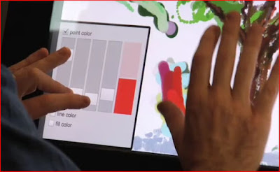
Wouldn't it be fun to paint like this?
The interface on the left is multi-touch and allows you to effortlessly fine-tune color selection as you paint. This interaction is described in the Adobe XD video below.
Senior Experience Designer Julie Meridian and Senior Computer Scientist Tim Kukulski discuss the future of multitouch, and showcase XD's cutting-edge multitouch R+D effort.
XD is the acronym for Adobe Experience Design, a multi-disciplinary group that numbers over 100. This group is focusing on multi-touch applications for a wide range of uses.
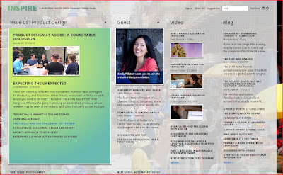
FYI: The Adobe Experience Design Team offers an on-line publication, "Inspire". I think that the website could use a re-design...
Ten-finger multitouch headed to mobile gadgets this year
Jacqueline Emigh, BetaNews, 7/22/09
"Synaptics, the creator of touchscreens already embellishing the iPhone and G1 Android phone, today rolled out new multitouch technology for mobile gizmos which rivals that of Microsoft-'s table-sized Surface."
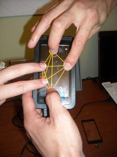
-photo from BetaNews
"For people interested in building their own multitouch-driven mobile applications, Synaptics plans a Microsoft Windows .NET-based development kit for the end of 2009, to coincide with the first 3000-driven handheld gaming machines, personal navigation devices (PNDs), and other gadgetry from Synaptics' OEM partners."
For more information, see the video.
RELATED
TechOnline's On-Demand Webinars:
Designing Compelling User Interfaces with Multi-touch All-Point Touchscreen Technology
Touch Screens: The Magic Behind Multi-Touch
Note: I haven't had a chance to see the above webinars. If you've viewed them, please leave a comment!

This is a rumor I've heard for a while. Here are a few articles:
Tech Rumor of the Day: Apple, Verizon Team Up on Tablet
Scott Moritz, TheStreet.com, 7/21/09
Apple to Release Subsidized Tablet Through Verizon Later This Year?
Eric Slivka, MacRumors, 7/22/09
I also heard that lots of things are happening at Adobe.

Wouldn't it be fun to paint like this?
The interface on the left is multi-touch and allows you to effortlessly fine-tune color selection as you paint. This interaction is described in the Adobe XD video below.
Senior Experience Designer Julie Meridian and Senior Computer Scientist Tim Kukulski discuss the future of multitouch, and showcase XD's cutting-edge multitouch R+D effort.
XD is the acronym for Adobe Experience Design, a multi-disciplinary group that numbers over 100. This group is focusing on multi-touch applications for a wide range of uses.
FYI: The Adobe Experience Design Team offers an on-line publication, "Inspire". I think that the website could use a re-design...

Ten-finger multitouch headed to mobile gadgets this year
Jacqueline Emigh, BetaNews, 7/22/09
"Synaptics, the creator of touchscreens already embellishing the iPhone and G1 Android phone, today rolled out new multitouch technology for mobile gizmos which rivals that of Microsoft-'s table-sized Surface."

-photo from BetaNews
"For people interested in building their own multitouch-driven mobile applications, Synaptics plans a Microsoft Windows .NET-based development kit for the end of 2009, to coincide with the first 3000-driven handheld gaming machines, personal navigation devices (PNDs), and other gadgetry from Synaptics' OEM partners."
For more information, see the video.
RELATED
TechOnline's On-Demand Webinars:
Designing Compelling User Interfaces with Multi-touch All-Point Touchscreen Technology
Touch Screens: The Magic Behind Multi-Touch
Note: I haven't had a chance to see the above webinars. If you've viewed them, please leave a comment!
Posted by
Lynn Marentette
Labels:
Adobe,
Apple,
experience design,
interaction design,
iTablet,
multi-touch,
synaptics,
verizon

 No comments:
Dr. Jan Borchers' (Annotated) Top Ten List of Books on Human-Computer Interaction - Of interest to HCI students (and HCI students at heart...)
The academic year is coming up, and a new wave of students will be searching for good resources pertaining to human-computer interaction and related areas of study. A couple of months ago, I shared the following information on a blog post, but thought it was worthy of recycling.
The list is useful to HCI students, but also to people who have little background in HCI who find themselves working on real-life projects that require a good amount of this knowledge.


Dr. Jan Borchers, head of the Media Computing Group at RWTH Aachen University, recommends the following list of books. I've read many of these books and I agree that this list is great. (The comments regarding the book are Dr. Borchers'.)
Dr. Jan Borchers' (Annotated) Top Ten List of Books on Human-Computer Interaction:
1. Alan Dix, Janet Finlay, Gregory D. Abowd, and Russell Beale: Human-Computer Interaction, 3rd ed., Prentice Hall, 2004. Currently the best, most well-rounded book I know to teach introductory HCI if you need to limit yourself to a single title. Technical enough, good breadth, not too fuzzy for a CS curriculum, very current, with a web site that includes resources such as sample programs, slides, etc.
2. Ben Shneiderman and Catherine Plaisant: Designing The User Interface, 4th ed., Pearson Addison-Wesley, 2004. Best overall reference book for all areas of HCI, providing an introduction and great up-to-date pointers to most sub-fields of HCI research and practice, especially different interaction techniques. His Golden Rules of User Interface Design and sample questionnaires for user testing are very useful in an introductory class. Unfortunately, the companion web site costs money after an initial trial period.
3. Donald A. Norman, The Design Of Everyday Things, Basic Books, 2002. A classic text from 1988 with an updated introduction that, while some of the technologies described or envisioned seem somewhat outdated now, still provides the best introduction to the spirit of good human-centered design. A not too technical read with hilarious stories of badly designed everyday technology, it provides some very useful basic models for human cognition, such as the Seven Stages of Action. This book also introduced the fundamental concept of affordances to HCI. Changed my view of the world of technology around me, and is probably the best initial brainwash for engineering students to "get" user-centered design.
4. Jenny Preece, Yvonne Rogers, and Helen Sharp: Interaction Design, 2nd ed., Wiley, 2007. This title focuses more on the process of designing good user interfaces, and is less technical, but excellent and up-to-date in the area it addresses. The companion web site has slides, case studies, and other materials.
5. Bill Moggridge, Designing Interactions, MIT Press, 2008. A truly beautiful "coffee-table style" book on interaction design, also covering product and industrial design of digital technology (Moggridge is a founder of IDEO). It has wonderful short essays about seminal digial product designs, from Engelbart's mouse, to the Mac and Palm, to Google and other internet services, as well as articles on digital product design theory. My own Sweet Sports and Baroque Technology article was based on one of the theory articles. Special treat: video interviews and chapters are available for free, on a weekly rotation, at http://www.designinginteractions.com/.
6. Bill Buxton, Sketching User Experiences, Elsevier, 2007. Similar to Moggridge's book in style, this book focuses on the early stages of product design. It also includes very interesting stories of key interactive products, such as Apple's iPod. And of course it's written by one of the long-time key players in HCI. More at http://www.billbuxton.com/.
7. Terry Winograd (ed.): Bringing Design to Software, Addison-Wesley, 1996. An excellent and very well edited collection of contributions from key players in HCI, from Kapor's Software Design Manifesto to Rheinfrank's Design Languages. Its particular value also comes from the profiles that link chapters and give an insider's view of how some of the most seminal UI designs came to be, from the Xerox Star to VisiCalc and HyperCard. Terry has some information about his book at http://hci.stanford.edu/bds/, and I used it with great success when I had the fortunate opportunity to teach an introductory HCI class in his program at Stanford in 2002.
8. Brenda Laurel (ed.): The Art of Human-Computer Interaction, Addison-Wesley, 1990. While ancient by today's standards, this book is another carefully compiled and very coherent collection of highly relevant articles on HCI by some of the most influential people in the field. I particularly like the article by Scott Kim on interdisciplinary design, and Tom Erickson's chapter.
9. Apple Computer: The Apple Software Design Guidelines, latest edition 2005. OK, I'm a Mac head, but then many HCI people are because Apple has such an excellent sense of doing the right thing when it comes to user interface design. These guidelines have been around since the 90's, with several new editions since then, and especially Part I ("Application Design Fundamentals") contains excellent, system-independent, hands-on advice for anybody developing interactive software, especially desktop applications. And it's free! Apple's developer website has the latest version both online and as downloadable PDF. I often recommend this as a quick read for engineering types that just want the bare essentials to help avoid major UI design catastrophes.
10. Jef Raskin, The Humane Interface, Addison-Wesley, 2000. Similar to Norman's book above, but more recent and more technical, this is another good first read to start thinking about user interface design, written by the father of the original Apple Macintosh. Some of the ideas presented here are quite unusual, and that's intended. Some related materials, such as demos of his Zoomable User Interface and The Humane Environment are at http://www.jefraskin.com/.
"So that's my top 10 list. I may add some more in the future. But I figure it's more important to restrict myself to those books I think are really outstanding than bother you with additional titles that don't really have that special something....For a good current PhD-level HCI reading list that is based more on papers and individual chapters than single books, see Terry Winograd's HCI reading list at Stanford University." -Dr. Jan Borchers
While you are at it, Dr. Borchers has a list of HCI hardware toolkits for physical user interface prototyping.
(I want to take more HCI classes and play with this stuff!)
The list is useful to HCI students, but also to people who have little background in HCI who find themselves working on real-life projects that require a good amount of this knowledge.


Dr. Jan Borchers, head of the Media Computing Group at RWTH Aachen University, recommends the following list of books. I've read many of these books and I agree that this list is great. (The comments regarding the book are Dr. Borchers'.)
Dr. Jan Borchers' (Annotated) Top Ten List of Books on Human-Computer Interaction:
1. Alan Dix, Janet Finlay, Gregory D. Abowd, and Russell Beale: Human-Computer Interaction, 3rd ed., Prentice Hall, 2004. Currently the best, most well-rounded book I know to teach introductory HCI if you need to limit yourself to a single title. Technical enough, good breadth, not too fuzzy for a CS curriculum, very current, with a web site that includes resources such as sample programs, slides, etc.
2. Ben Shneiderman and Catherine Plaisant: Designing The User Interface, 4th ed., Pearson Addison-Wesley, 2004. Best overall reference book for all areas of HCI, providing an introduction and great up-to-date pointers to most sub-fields of HCI research and practice, especially different interaction techniques. His Golden Rules of User Interface Design and sample questionnaires for user testing are very useful in an introductory class. Unfortunately, the companion web site costs money after an initial trial period.
3. Donald A. Norman, The Design Of Everyday Things, Basic Books, 2002. A classic text from 1988 with an updated introduction that, while some of the technologies described or envisioned seem somewhat outdated now, still provides the best introduction to the spirit of good human-centered design. A not too technical read with hilarious stories of badly designed everyday technology, it provides some very useful basic models for human cognition, such as the Seven Stages of Action. This book also introduced the fundamental concept of affordances to HCI. Changed my view of the world of technology around me, and is probably the best initial brainwash for engineering students to "get" user-centered design.
4. Jenny Preece, Yvonne Rogers, and Helen Sharp: Interaction Design, 2nd ed., Wiley, 2007. This title focuses more on the process of designing good user interfaces, and is less technical, but excellent and up-to-date in the area it addresses. The companion web site has slides, case studies, and other materials.
5. Bill Moggridge, Designing Interactions, MIT Press, 2008. A truly beautiful "coffee-table style" book on interaction design, also covering product and industrial design of digital technology (Moggridge is a founder of IDEO). It has wonderful short essays about seminal digial product designs, from Engelbart's mouse, to the Mac and Palm, to Google and other internet services, as well as articles on digital product design theory. My own Sweet Sports and Baroque Technology article was based on one of the theory articles. Special treat: video interviews and chapters are available for free, on a weekly rotation, at http://www.designinginteractions.com/.
6. Bill Buxton, Sketching User Experiences, Elsevier, 2007. Similar to Moggridge's book in style, this book focuses on the early stages of product design. It also includes very interesting stories of key interactive products, such as Apple's iPod. And of course it's written by one of the long-time key players in HCI. More at http://www.billbuxton.com/.
7. Terry Winograd (ed.): Bringing Design to Software, Addison-Wesley, 1996. An excellent and very well edited collection of contributions from key players in HCI, from Kapor's Software Design Manifesto to Rheinfrank's Design Languages. Its particular value also comes from the profiles that link chapters and give an insider's view of how some of the most seminal UI designs came to be, from the Xerox Star to VisiCalc and HyperCard. Terry has some information about his book at http://hci.stanford.edu/bds/, and I used it with great success when I had the fortunate opportunity to teach an introductory HCI class in his program at Stanford in 2002.
8. Brenda Laurel (ed.): The Art of Human-Computer Interaction, Addison-Wesley, 1990. While ancient by today's standards, this book is another carefully compiled and very coherent collection of highly relevant articles on HCI by some of the most influential people in the field. I particularly like the article by Scott Kim on interdisciplinary design, and Tom Erickson's chapter.
9. Apple Computer: The Apple Software Design Guidelines, latest edition 2005. OK, I'm a Mac head, but then many HCI people are because Apple has such an excellent sense of doing the right thing when it comes to user interface design. These guidelines have been around since the 90's, with several new editions since then, and especially Part I ("Application Design Fundamentals") contains excellent, system-independent, hands-on advice for anybody developing interactive software, especially desktop applications. And it's free! Apple's developer website has the latest version both online and as downloadable PDF. I often recommend this as a quick read for engineering types that just want the bare essentials to help avoid major UI design catastrophes.
10. Jef Raskin, The Humane Interface, Addison-Wesley, 2000. Similar to Norman's book above, but more recent and more technical, this is another good first read to start thinking about user interface design, written by the father of the original Apple Macintosh. Some of the ideas presented here are quite unusual, and that's intended. Some related materials, such as demos of his Zoomable User Interface and The Humane Environment are at http://www.jefraskin.com/.
"So that's my top 10 list. I may add some more in the future. But I figure it's more important to restrict myself to those books I think are really outstanding than bother you with additional titles that don't really have that special something....For a good current PhD-level HCI reading list that is based more on papers and individual chapters than single books, see Terry Winograd's HCI reading list at Stanford University." -Dr. Jan Borchers
While you are at it, Dr. Borchers has a list of HCI hardware toolkits for physical user interface prototyping.
(I want to take more HCI classes and play with this stuff!)
Posted by
Lynn Marentette
Jul 19, 2009
Global Imagination's Magic Planet: An Interactive Digital Sphere
Global Imagination's Magic Planet is getting around. It is an interactive digital sphere that has been featured in a variety of museum exhibits, but has also been used for promotions and in educational settings.
According to the Global Imagination website, "Global Imagination® makes the Magic Planet® digital video globe - the digital display with a sphere-shaped screen. We also supply software, content and services that enable you to present global information and promotional media in the most compelling and interactive way possible."
"The Magic Planet: a digital video globe that displays real-time weather and earthquake information and a dramatic animation of the shifting continents from today back 400 million years".
For a closer look at the Magic Planet, visit Global Imagination's picture gallery page. The products page provides pictures and descriptions of Global Imagination's hardware and extensive range of software choices, including touch screen templates, end-user applications, and developer tools. You can also download the Magic Planet brochure.
The video of the Magic Planet from 2007, from the Asian Tsunami Exhibit at Yale, can can be viewed on YouTube.
For your convenience, here are links to the companies that partner with Global Imagination:


Posted by
Lynn Marentette
Jul 17, 2009
The new iPhone icons can speak: "Voiceover" makes it accessible to people with vision impairments - Via David Pogue
More...(drag mouse)
Next Tab
Forward
Page Bottom
Toggle Bookmarks
Close Tab
Back
Page top


Apple is mindful of people with disabilities. The virtual tour of the new 3GS has a closed-captioned option.


The iPhone 3GS. I want one.
Posted by
Lynn Marentette
Jul 16, 2009
Convergence: Mobile content, Interactive Displays, Digital Out of Home, & Danoo
Danoo: "Location scouting and scalable web technologies combined to create a targeted DOOH experience".
If you are tech-savy and a member of the digital signage/interactive display/AV end of things, you probably know what this means. If not, you should. Things are pairing, merging, and converging in the world of "out and about" technology.
Technology, especially digital signage, is ubiquitous, and has targeted you and your neighborhood.
So what's the fuss? A company from Danoo, from China, is ramping things up in the Digital Signage/DOOH (Digital Out of Home) arena. Fast.
Danoo has rapidly up with exisiting companies, such as National CineMedia, Blue Bite, Electronic Arts, and the HISTORY channel to create and push off-the-desktop and off-the-TV content and interactive user experiences. Bill Gerba, of Wirespring, and Manolo Almagro, CTO of Show + Tell in NYC (think Times Square digital signage experiences), and others have recently written about this phenomenon, right after Danoo released the following press announcement:
Danoo Inc Announces a Breakthrough in Mobile Content Delivery (7/11/09, Business Wire)
"Danoo partnered with mobile technology company Blue Bite to enable the campaigns, and is actively rolling out its mobile interactivity capability to all of its venues. The first 200 Danoo locations will be live in Los Angeles and New York by July 1st. At full deployment, Danoo will give advertisers the ability to get their content into the hands of more than 200,000 consumers in an average two-week campaign. In addition to content downloads, Danoo offers multiple ways to pair its screens with mobile interactivity to maximize campaign effectiveness, such as SMS call-to-actions, social gaming and mobile application promotion."
"Visitors to Danoo locations viewed video content on Danoo’s digital screens accompanied by an on-screen prompt to download exclusive content such as sneak peeks and ringtones from their Bluetooth or Wi-Fi-enabled devices via the Danoo network."
Here are a few related articles:
How Significant is the Danoo-IdeaCast-National CineMedia Deal?
(7/14/09, Bill Gerba, Wirespring)
A Watershed Moment for DOOH Media
(7/12/09, Bill Collins, Daily DOOH)
Pictures from Danoo's Website:
Danoo's IdeaCast- "Captive TV".


I've probably encountered Danoo's technologies numerous times, judging from my archive of pictures of displays and related technologies that have crossed my path. The TV screen on the treadmill looks just like the one I saw on a treadmill in the fitness center of a Princess cruise ship last year. The picture in the middle looks like it was taken in an airport. The picture on the right is of a system in a coffeehouse. According to information on the Danoo website, the system is interactive and includes "content downloads, social gaming, mobile couponing and more via SMS, Bluetooth and Wi-Fi".
Blue Bite's website is worth looking at. It demonstrates their concept very well through animation:
Blue Bite: "Take the Ad With You"
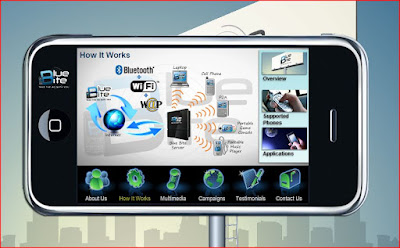
Things are ramping up in my region, too.
T1 Tapas, a restaurant north of Charlotte, N.C., in the Birkdale Village in Huntersville, has majority owners with a technology background. Mike Feldman and Jim Morris started up Digital Optics Corporation, which focused on optics for computers and imaging, and after they sold their company, they teamed up with Denise Feldman to establish their company.
T 1 Connection Booth with Multi-User Touch Screen, HD TV, Sound System, Computer, & more:
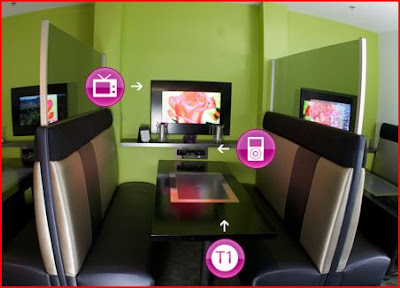
"T1 Connection Booth seating gives you access to music, photos, and videos through built-in touchscreen tabletops, brilliant monitors, speakers, and computers." -Picture and taken from the T 1 Tapas website
The restaraunt serves as a test bed for T 1 Visions to try out their software and hardware designed to enhance the digitally connected dining experience. The restaurant was featured in May of this year on CNN:
Here is the link to the video: "High Tech Tapas"
If you are tech-savy and a member of the digital signage/interactive display/AV end of things, you probably know what this means. If not, you should. Things are pairing, merging, and converging in the world of "out and about" technology.
Technology, especially digital signage, is ubiquitous, and has targeted you and your neighborhood.
So what's the fuss? A company from Danoo, from China, is ramping things up in the Digital Signage/DOOH (Digital Out of Home) arena. Fast.
Danoo has rapidly up with exisiting companies, such as National CineMedia, Blue Bite, Electronic Arts, and the HISTORY channel to create and push off-the-desktop and off-the-TV content and interactive user experiences. Bill Gerba, of Wirespring, and Manolo Almagro, CTO of Show + Tell in NYC (think Times Square digital signage experiences), and others have recently written about this phenomenon, right after Danoo released the following press announcement:
Danoo Inc Announces a Breakthrough in Mobile Content Delivery (7/11/09, Business Wire)
"Danoo partnered with mobile technology company Blue Bite to enable the campaigns, and is actively rolling out its mobile interactivity capability to all of its venues. The first 200 Danoo locations will be live in Los Angeles and New York by July 1st. At full deployment, Danoo will give advertisers the ability to get their content into the hands of more than 200,000 consumers in an average two-week campaign. In addition to content downloads, Danoo offers multiple ways to pair its screens with mobile interactivity to maximize campaign effectiveness, such as SMS call-to-actions, social gaming and mobile application promotion."
"Visitors to Danoo locations viewed video content on Danoo’s digital screens accompanied by an on-screen prompt to download exclusive content such as sneak peeks and ringtones from their Bluetooth or Wi-Fi-enabled devices via the Danoo network."
Here are a few related articles:
How Significant is the Danoo-IdeaCast-National CineMedia Deal?
(7/14/09, Bill Gerba, Wirespring)
A Watershed Moment for DOOH Media
(7/12/09, Bill Collins, Daily DOOH)
Pictures from Danoo's Website:
Danoo's IdeaCast- "Captive TV".


I've probably encountered Danoo's technologies numerous times, judging from my archive of pictures of displays and related technologies that have crossed my path. The TV screen on the treadmill looks just like the one I saw on a treadmill in the fitness center of a Princess cruise ship last year. The picture in the middle looks like it was taken in an airport. The picture on the right is of a system in a coffeehouse. According to information on the Danoo website, the system is interactive and includes "content downloads, social gaming, mobile couponing and more via SMS, Bluetooth and Wi-Fi".
Blue Bite's website is worth looking at. It demonstrates their concept very well through animation:
Blue Bite: "Take the Ad With You"

Things are ramping up in my region, too.
T1 Tapas, a restaurant north of Charlotte, N.C., in the Birkdale Village in Huntersville, has majority owners with a technology background. Mike Feldman and Jim Morris started up Digital Optics Corporation, which focused on optics for computers and imaging, and after they sold their company, they teamed up with Denise Feldman to establish their company.
T 1 Connection Booth with Multi-User Touch Screen, HD TV, Sound System, Computer, & more:

"T1 Connection Booth seating gives you access to music, photos, and videos through built-in touchscreen tabletops, brilliant monitors, speakers, and computers." -Picture and taken from the T 1 Tapas website
The restaraunt serves as a test bed for T 1 Visions to try out their software and hardware designed to enhance the digitally connected dining experience. The restaurant was featured in May of this year on CNN:
Here is the link to the video: "High Tech Tapas"
Posted by
Lynn Marentette
Off Topic: My Summer Vacation Pictures
The pictures were taken in Scotland, Norway, Ireland, England, and France.
Posted by
Lynn Marentette
Interactive Multimedia Technology Themes -Update on Travel Technologies
Over the next month or so I will be re-organizing this blog. I'll be analyzing the various themes that have emerged since I started this on 4/11/06, over three years ago, as part of an assignment for a class about distance education and on-line communication tools.


My first topic was "Games, Simulations, and Virtual Worlds". Although I continue to focus on those themes, I mostly center around off-the-desktop interactive, collaborative, and emerging technologies that support interaction and activities in public spaces.
One theme that interests me is technology that supports travel experiences. Since I've had the opportunity to travel a great deal (before the economy started to go downhill), I've had a chance to explore this arena as a participant-observer*, and have documented my findings through photographs and video.
It is a joke in my family that if I disappear from the tribe, I can usually be found nearby, poking at an interactive touch screen, photographing something related to technology, or sneaking in a few shots of other people interacting with technology, and sometimes even talking to strangers as they use technology. (I usually ask permission to take pictures of people who are in my view finder, but sometimes they just happen to be in my line of sight.)
It is amazing what an earful you can get about technology as a fellow traveller!
I came across the work of Nanonation when I was on a Royal Caribbean cruise ship, and was a little disappointed with the touch-screen content and interaction around the ship. From what I can tell from the NanoNation website, the applications have been improved somewhat, especially the way-finding application on the Freedom of the Seas:
Wayfinding Application, Freedom of the Seas

Nanonation was also involved in the development of a "Discovery Wall" at the Umpqua bank. This system incorporates tangible icons that sit on a shelf located near the Discovery Wall that trigger an interactive flash presentation on a screen. The icons represent various bank products, and are RFID enabled.
Discovery Wall, Umpqua Bank

Back to the topic of cruise ship/travel technology:
When I was on the Ruby Princess cruise in December of 2008, I was impressed with the "Movies Under the Stars" set-up. At night, the sunning decks are transformed into out-door movie viewing spots, where you can lounge around, basking under the stars at you watch the gigantic silver screen and excellent sound system.
During the day, the system is used to display games that people play on the Wii, which provides the non-playing sunbathers additional entertainment.
I recently learned that the Movies Under the Stars system was developed and installed by FUNA, an international company that focuses on marine-related industries, as well as land-based industries.
Take a look to my "Wii-OOH" Flickr set slideshow to see the Wii in action on the large screen of the Ruby Princess, and on smaller screens in the food-court of the Concord Mills (NC) mall:
(Note, the mall pictures were taken with my cell phone.)

I want to go back!
HCI Note
*I was trained in the use of participant observation long ago, when I was studying social science
and psychology at the University of Michigan. It is a method that was developed early on by anthropologists
and sociologists, and adopted later by researchers in other fields. Some human-computer interaction
researchers use this method, and related techniques, such as ethnography, in their work.
Posted by
Lynn Marentette
Subscribe to:
Posts (Atom)